Restaurant and hotel advertisement postcards
2024-02-26
Content Warning: This page contains transcriptions and images of postcards advertising a number of mid-century American restaurants and hotels that appropriated the cultural signifiers (names, designs) of Asian, Pasifika, and other cultures. As with all acts of cultural appropriation, the representations of the referenced cultures in these postcards are almost never accurate and are often plainly racist and otherwise offensive. There are also a few establishments in Asia (a hotel in Beijing, an Arabic restaurant in Jerusalem, and others). The location of each establishment is included in the section describing the postcard. When I've felt that something about one of these establishments was particularly offensive or heinous, I've said so. But, in general, take it for granted that I do not endorse cultural appropriation, of which many of these are indeed historical and sometimes contemporary examples! The history of Asian and Pasifika cultural representation and appropriation in the United States, particularly with food, is complex. If you want to know more about this from a perspective that crosses over food and design history, this video on the history of "Chop Suey" fonts, which were commonly used in Chinese themed restaurants in the US (and are sometimes pictured in these postcards), is excellent, and includes interviews with Asian designers discussing the font. Throughout the post, I've shared a number of links to other resources helpful in contextualising and understanding the racist and often colonial roots of these establishments abroad.
Last month, my spouse and I visited family living in the US. While there, we stopped by a small local crafts store, which turned out to have an antique section in the back. Mostly there were old local newsletters, coke bottles, a variety of old books (with no obvious connection to each other, besides being "old"), that sort of thing. They also had four boxes the size of shoeboxes filled with old postcards. We spent nearly two hours looking through the boxes, having a blast finding ones to send to friends and family. Most of these were the sort of motel advertisement postcards disguised as mementos, which people apparently sell for heaps online these days. Ours were 25 US cents each, and we took home just under 100 of them, in the end. About halfway through the first box I looked through, I noticed there were a decent number of postcards for Chinese restaurants, and these caught my eye. I started setting them aside, to look at later, and asked my spouse to keep an eye out for any they found. In the end, we found a lot of postcards for Chinese restaurants and hotels, mostly of ones "themed" as such, but including a few actual Chinese hotels. We also found some for Asian and Pasifika cultures more broadly, including one of a restaurant in Jerusalem serving "Arabic" food. I pulled out any others that caught my eye, in particular looking for any hotels or restaurants that weren't the typical motor motels (for which there were hundreds of postcards). Up front, I noticed two interesting things: some of the American restaurants were serving specifically Cantonese food, and that was almost the only specific cuisine term used in any of them. The terms used otherwise were broad like "Arabic", "Polynesian", and "Chinese", each of which encompass a number of distinct cuisines. That is an important distinction today, but for mid-century Americans, both those serving and eating food, these broader descriptors were apparently more useful. Though, "Chinese" and "Mexican" are still used to describe restaurant's cuisine today, despite the relative broadness of those terms.
There are a lot of references to "tiki" aesthetic as well. Later on I link an article in the LA Times that discusses the racism inherent in the "tiki" restaurant/bar aesthetic, including its roots in American colonialism in the Pacific.
Last weekend I finally sat down to scan these using my camera, an OM-5 Mark III. It was my first time using my camera in this way, and I learned a bit along the way. I didn't start off with a white background at first, and there's a marked difference in the contrast of those photographs, and in their white balance. I did not spend the time it would take to develop each of these from RAW, choosing instead to let my camera do its thing and develop the JPEGs itself. The only lighting I used was natural light. I've torn apart a broken LCD screen to get the diffusers out of it, to build my own flash diffusion rig, but I have not gotten around to doing that yet. Natural lighting, coming from the outside, was consistent for most of the 90 or so minutes I spent taking these photos, and, importantly, never caused any shadows to cast over the subjects. When I tried to hold a flashlight or use flash, either the lens or a tripod leg would invariably end up casting a shadow, and I saw quickly it would only lead to frustration trying to do this without better tools. My tripod stood in for a traditional copy-stand rig, and did just a fine job straddled over the corner of my desk. I used a 2-second timer and kept the aperture wide, but probably not as wide as I should have. The aperture I settled on, f/9, seems to have caught the detail I wanted, but if I did this again, I would go all the way to f/22. However, I also had to contend with being on the second storey, with large trucks occasionally passing by causing vibrations. In that respect, f/9 struck a good balance of never causing too slow a shutter speed that those disruptions ever affected the photographs. I do not have a macro lens, which is what I've read is the "best" for this sort of "scanning", but my Olympus 12-40 mm 1:2.8 PRO is as sharp as they get (matching Olympus's primes, of which I only have one anyway), and allowed me to overcome the main deficiency of using my tripod as a copy stand, in a room with not much space. I could not spread the tripod legs beyond their narrowest angle, which meant I was limited by the width of the two legs of my tripod straddling the corner of my desk. With the 12-40 mm, I was able to zoom to just about the narrowest I would tolerate, considering I was planning to crop anyway, and wanted to be able to have a letter marker in each photograph to prevent any confusion over which two photographs of a postcard went together.
I present to you the postcards, in alphabetical order, along with any specific observations I have about each one. In total there are 23 postcards, but only 20 establishments because three had two postcards, two being nearly duplicates of each other, which I didn't notice during collection, only during the photographing process. I've transcribed the information on the back of the card, and specially noted anything that looks like an identifier for the card in bold at the top of each section. Like I mentioned above, I've sometimes also included information to help contextualise the postcard.
Not all postcards listed the place of printing. Two were actually mailed, and I've blacked out addresses for privacy reasons (in one case, reinforcing a previous collector's bad attempt at redaction-by-sharpie).
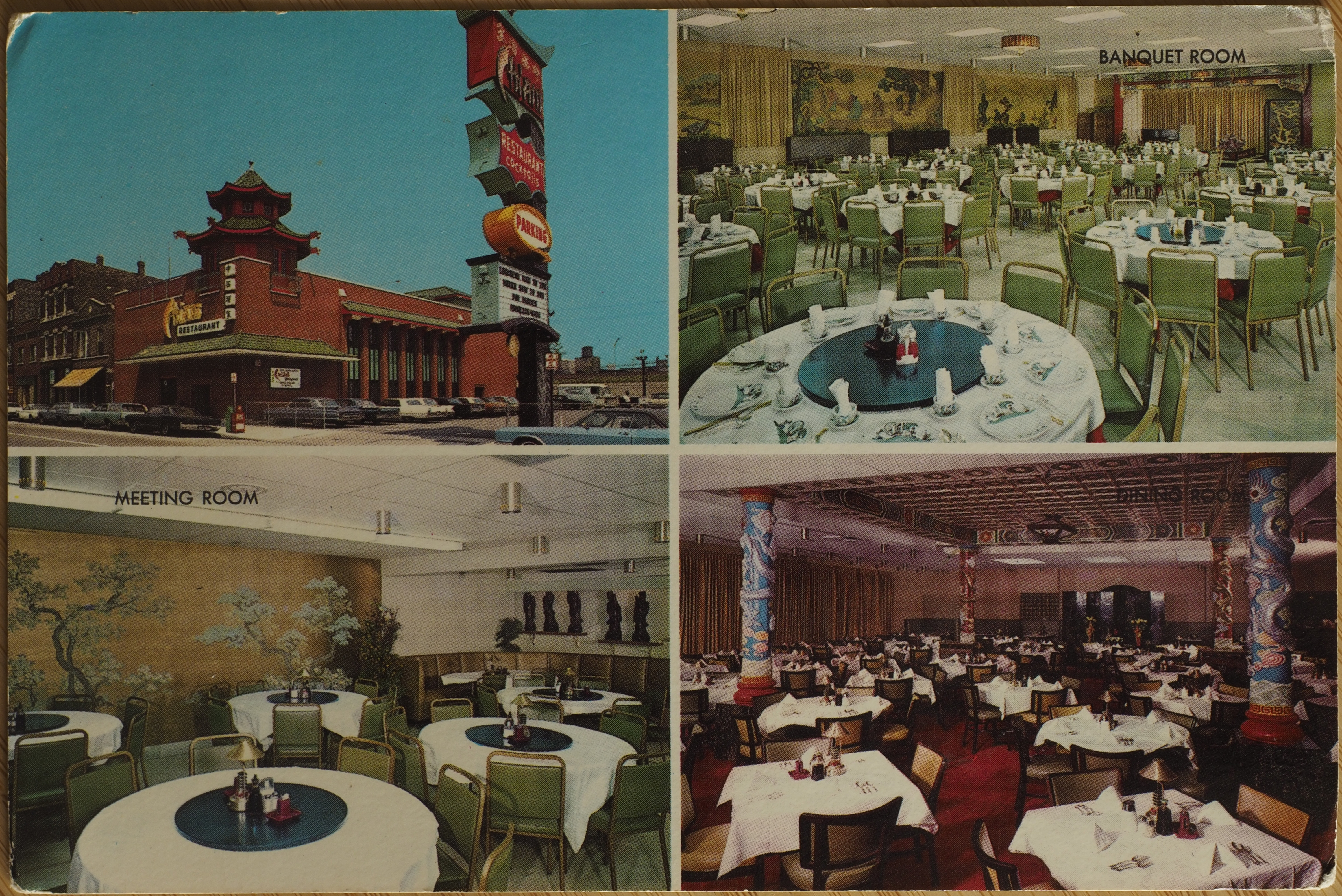
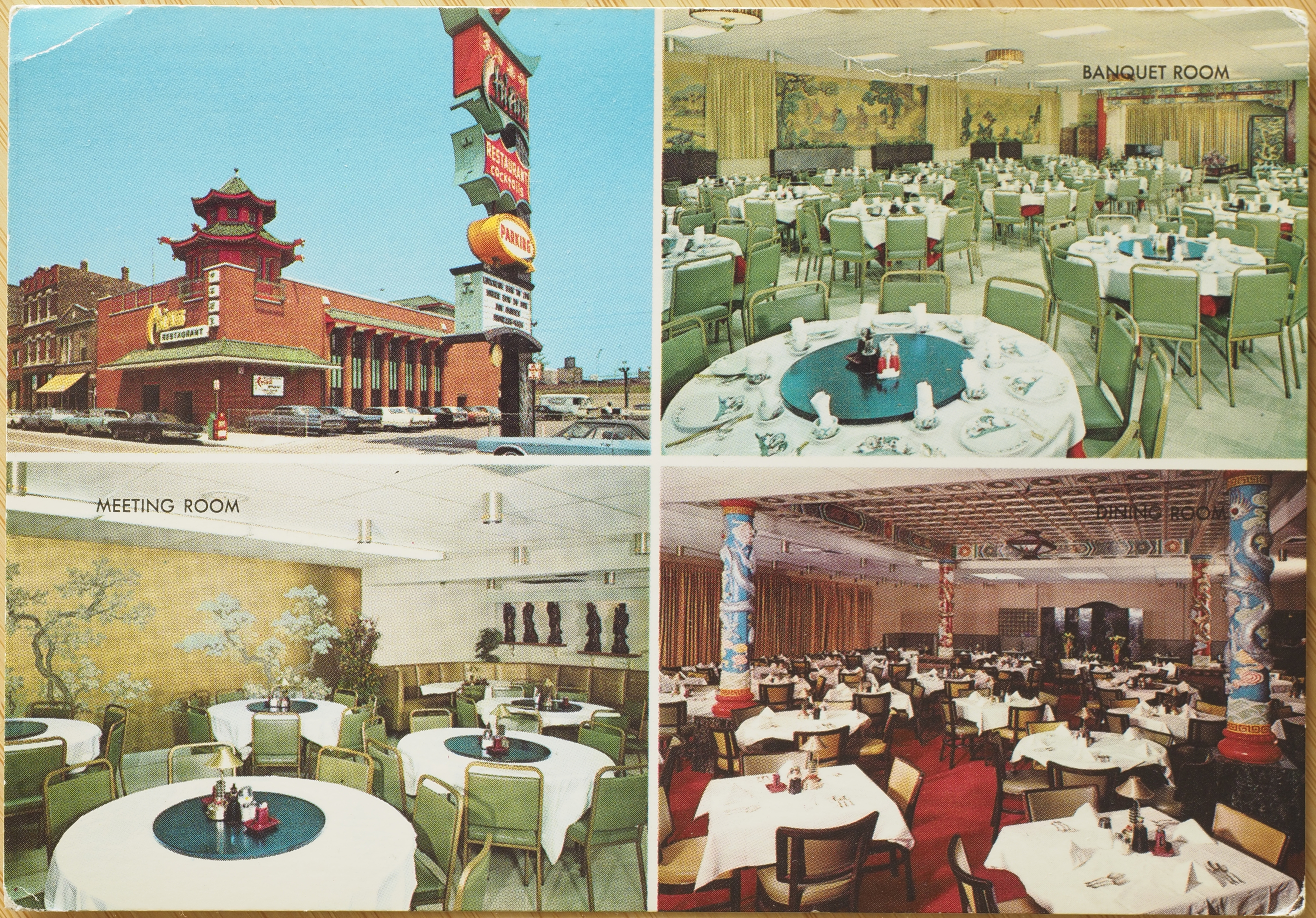
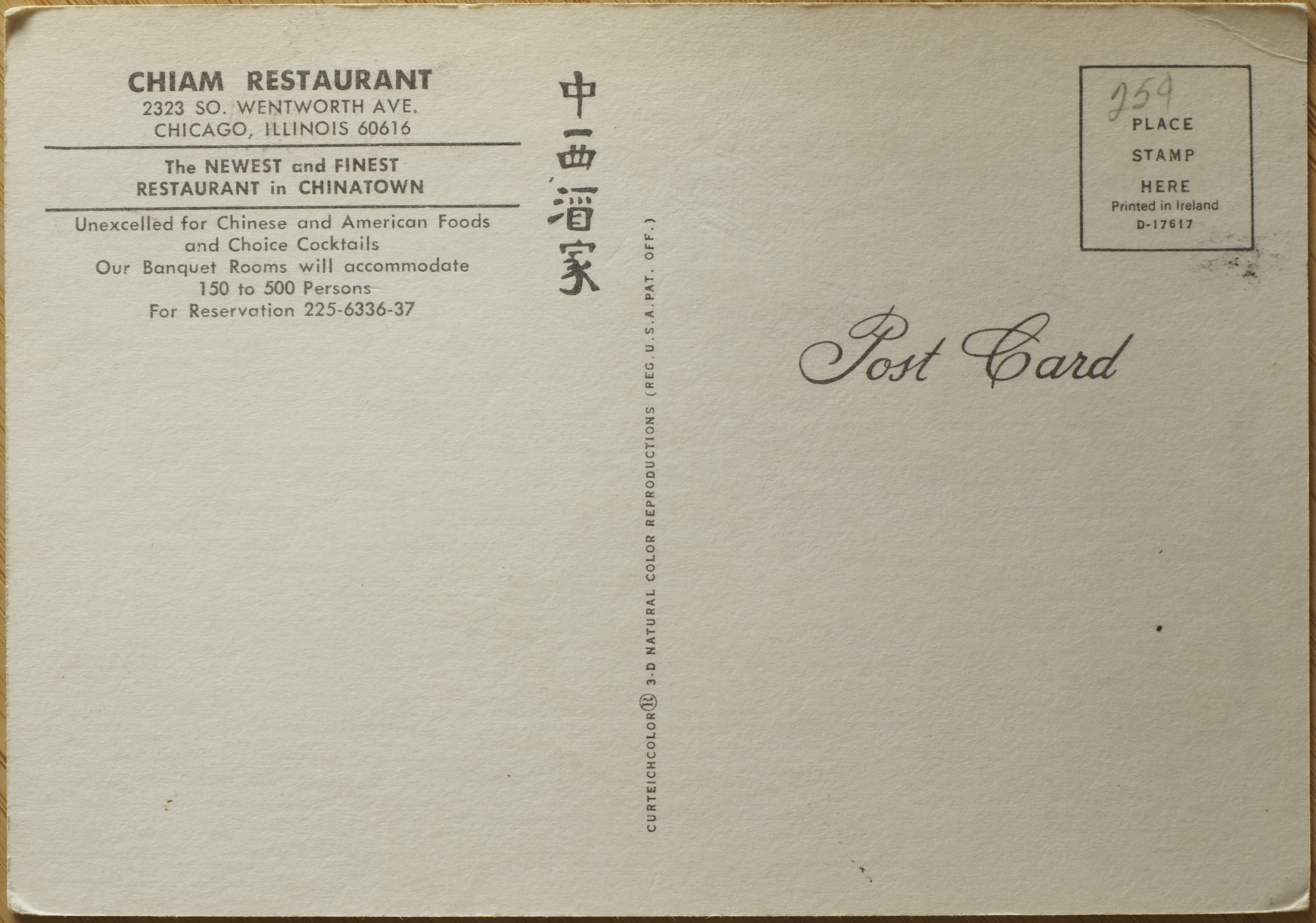
Chiam Restaurant
D-17618
These two postcards have the same front, but curiously, and only slightly, distinct backs. The text is nearly identical on both, the only difference being that version B lists where it was printed, whereas A does not.
CHIAM RESTAURANT
2323 SO. WENTWORTH AVE.
CHICAGO, ILLINOIS 60616The NEWEST and FINEST RESTAURANT in CHINATOWN
Unexcelled for Chinese and American Foods and Choice Cocktails
Our Banquet Rooms will accommodate 150 to 500 Persons
For reservation 225-6336-37
The text of both versions is identical, aside from the following:
- Version B states it was printed in Ireland. Version A has no indication of where it was printed.
- Version A has a lighter, greener text, whereas version B is a much darker and drab green. This is not an artefact of white balance issues, and the difference in text colour is obvious in person.
Despite the photographs not reflecting this, the photographs on the front of each are identical in person. This makes me think that the difference in the colour used for the text on the back is an intentional difference at production time, rather than an issue with the green ink used in Ireland going darker over time. That's because the greens in the photograph (for example, in the chairs) are identical.
Version A

Version B
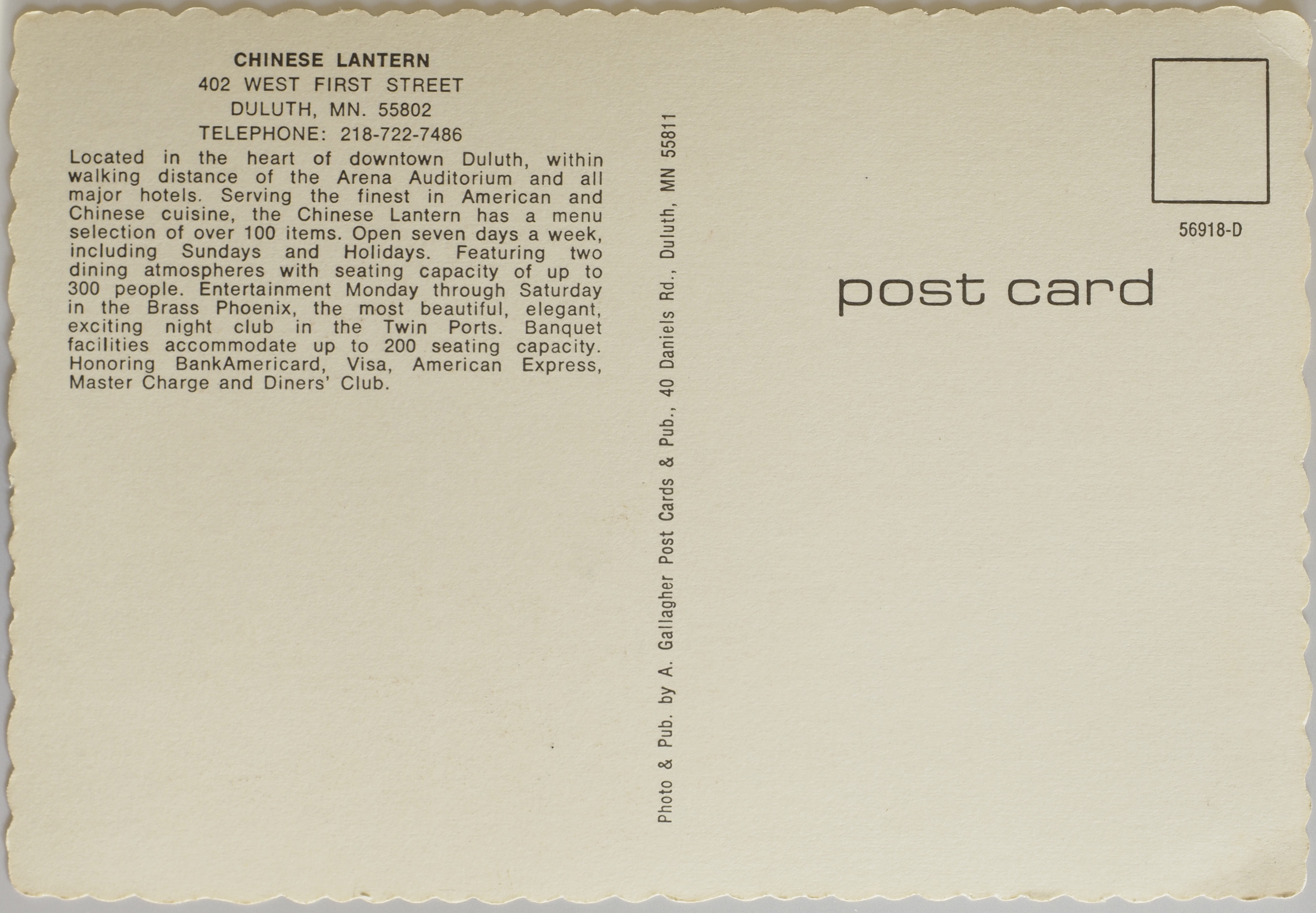
Chinese Lantern
56918-D
CHINESE LANTERN
402 WEST FIRST STREET
DULUTH, MN. 55802
TELEPHONE: 218-722-7486Located in the heart of downtown Duluth, within walking distance of the Arena Auditorium and all major hotels. Serving the finest in American and Chinese cuisine, the Chinese Lantern has a menu selection of over 100 items. Open seven days a week, including Sundays and Holidays. Featuring two dining atmospheres with seating capacity of up to 300 people. Entertainment Monday through Saturday in the Brass Phoenix, the most beautiful, elegant, exciting night club in the Twin Ports. Banquet facilities accommodate up to 200 seating capacity. Honoring BankAmericard, Visa, American Express, Master Charge, and Diners' Club.
On the "spine":
Photo & Pub by A. Gallagher Post Cards & Pub., 40 Daniels Rd., Duluth, MN 55811

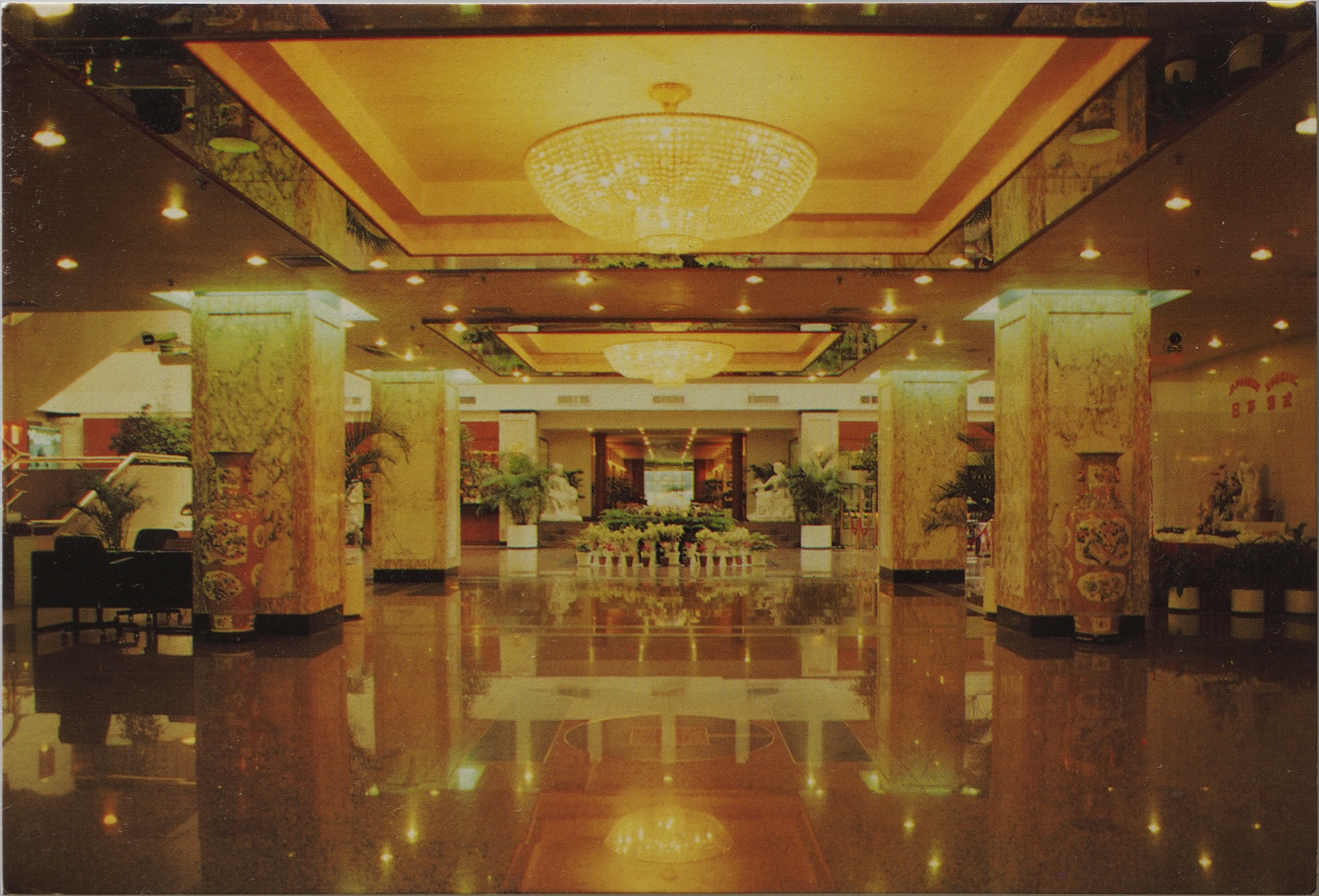
Cvik Hotel
The postcard has no identifying number. Photo on the front is described as the lobby.
CVIK HOTEL
22 Jianguomenwai Avenue, Beijing, China
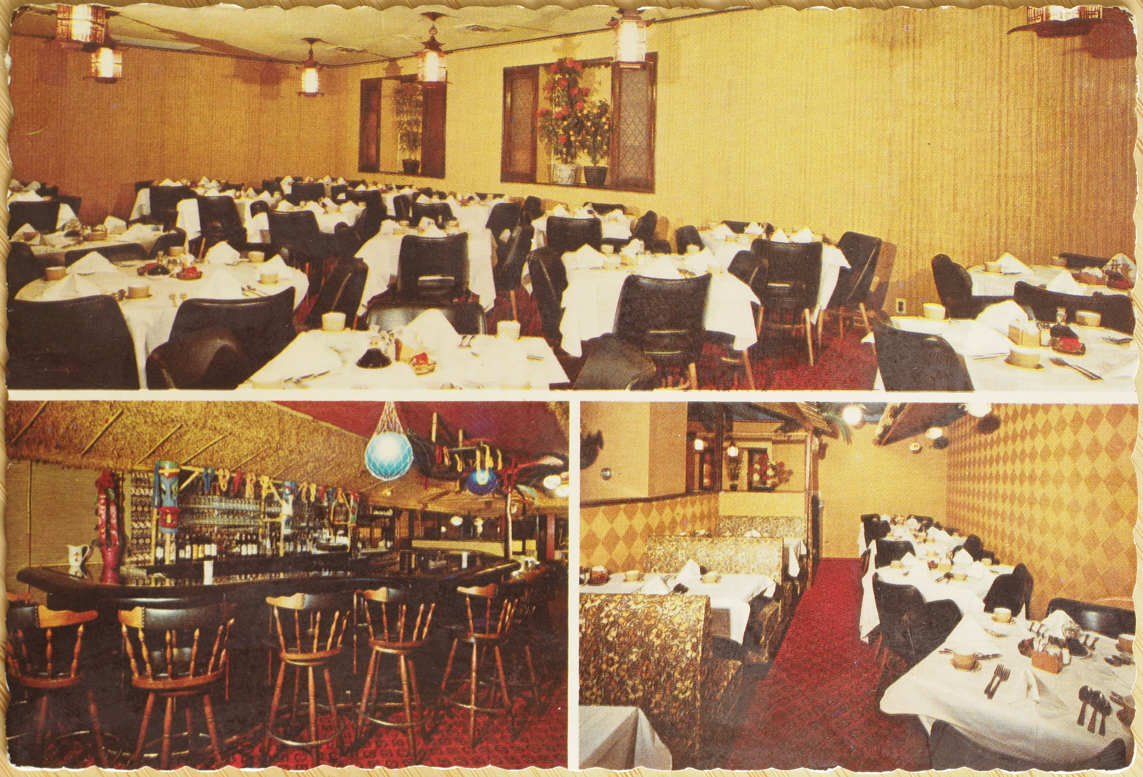
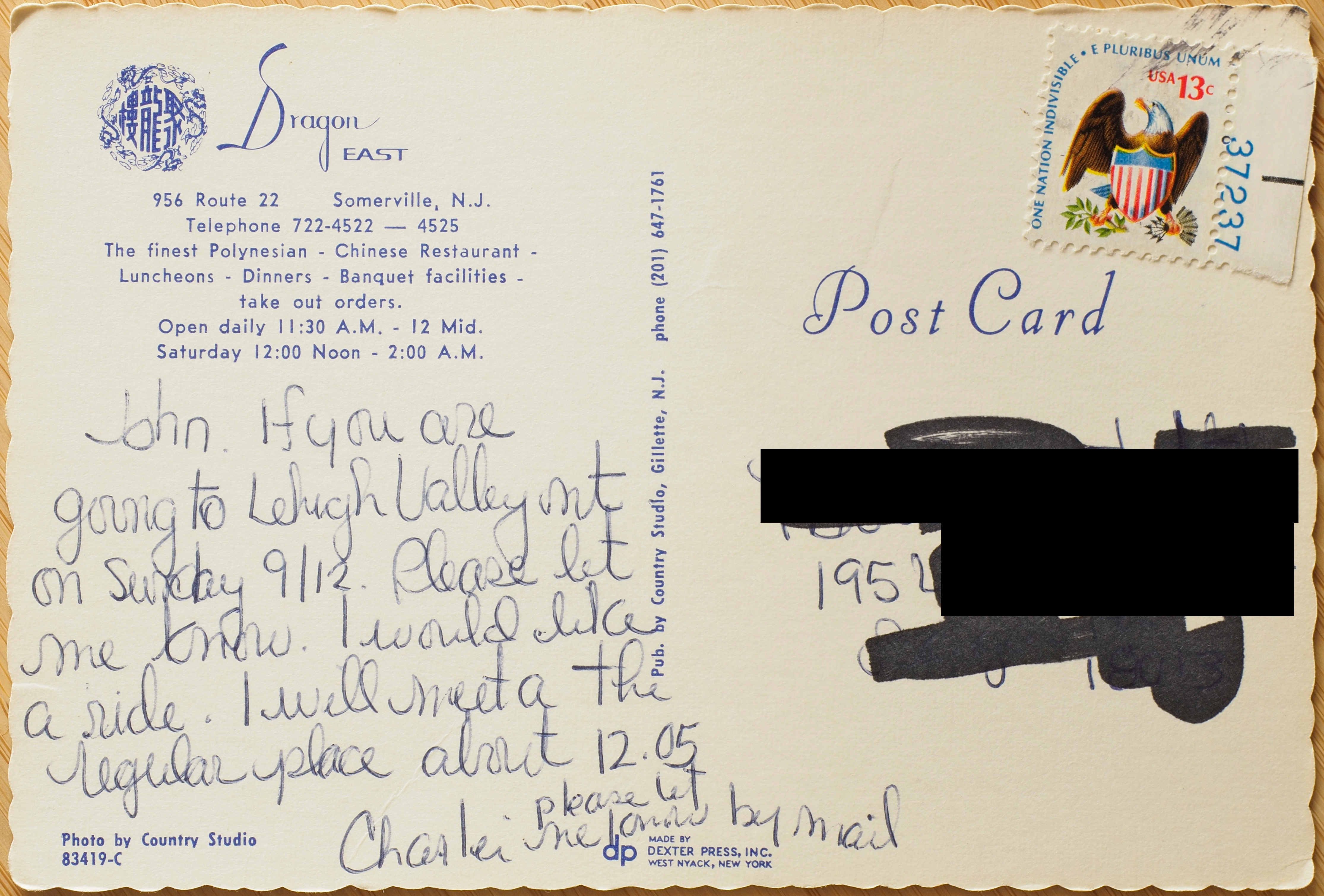
Dragon East
83419-C
Dragon East
956 Route 22 - Somerville, N.J.
Telephone 722-4522 — 4525
The finest Polynesian - Chinese Restaurant -
Luncheons - Dinners - Banquet facilities -
take out orders.
Open daily 11:30 A.M. - 12 Mid.
Saturday 12:00 Noon - 2:00 A.M.
Made by
DEXTER PRESS, INC.
West Nyack, New York
On the "spine":
Pub. by Country Studeio, Gillette, N.J. phone (201) 647-1761
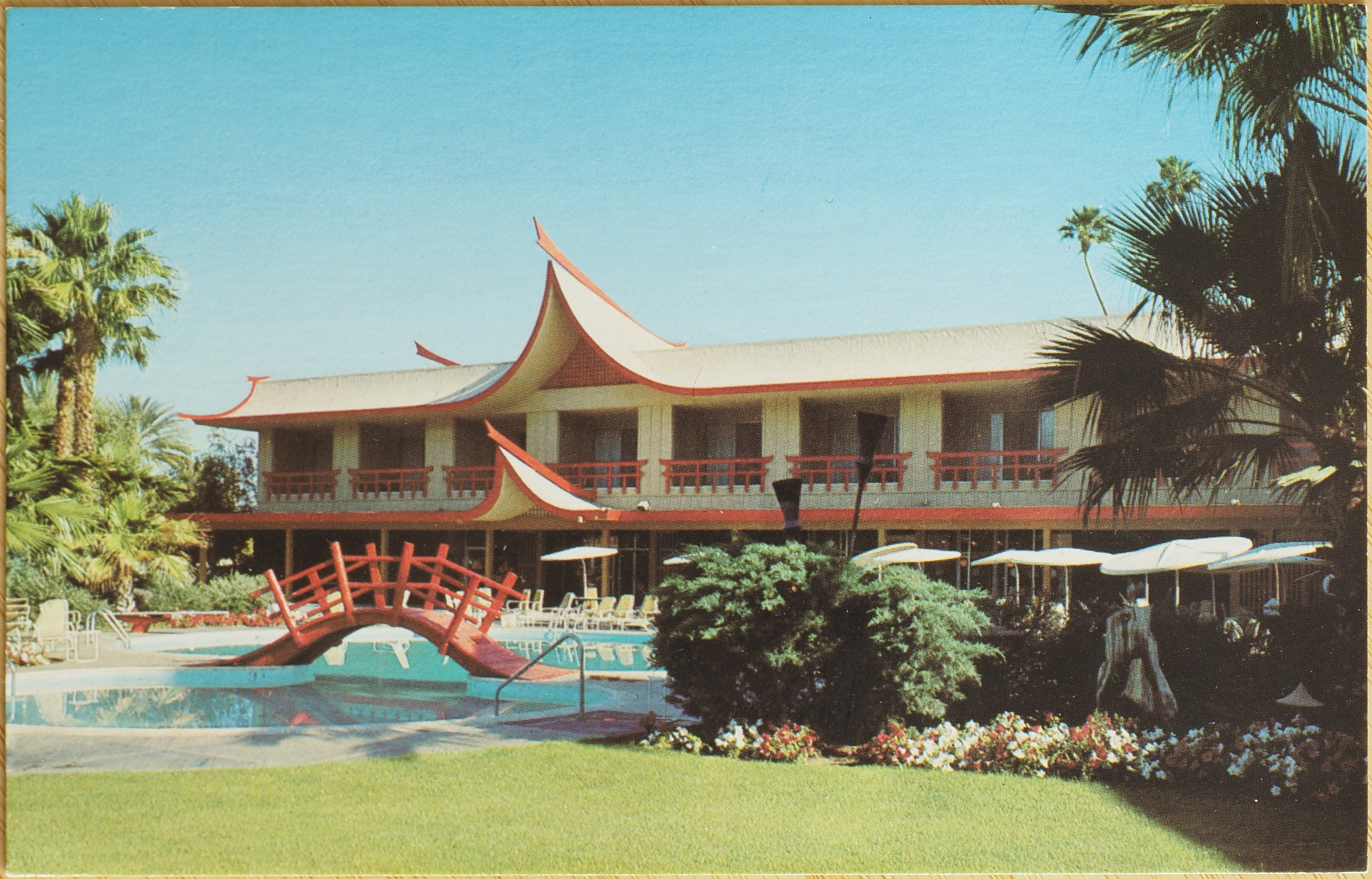
Erawan Garden Hotel
SC12816
ERAWAN GARDEN HOTEL
76-477 Highway 111
Indian Wells, California 92260
(714) 346-8021Located in the Golf Capital of the world, just beyond Palm Springs toward La Quinta, Erawan Garden offers luxurious air-conditioned accommodations, two unique swimming pools, sauna baths, therapeutic pool, tennis, putting green, dining and entertainment nightly.
When we were looking through the stack of postcards at the store, this one in particular caught my eye because it didn't mention any specific culture it was referencing, and it struck me as potentially referencing South-East Asia, which was unique in the stack of postcards. A quick search online brought up an article about the hotel receiving a historic landmark designation in its town (archive link (without trackers)), despite having undergone a significant renovation years ago that seems to have removed the features shown in the postcard. The article notes that the inspiration for the hotel's original design was an Erawan Hotel in Bangkok. I can't find a picture of a hotel that seems to have plausibly inspired the one in the postcard, and all searches for "Erawan Hotel" now result in a more recently constructed Hyatt. However, the original hotel was meant to be near the shrine of the same name, and I was able to find a nice photograph of the shrine with the Hyatt behind it (presumably the Hyatt replaced the original inspiration for the postcard's): "Grand Hyatt Hotel with Erawan Shrine flanked by the 2 BTS Skytrain tracks in Bangkok, Thailand" by UweBKK (α 7 M IV on ) is licensed under CC BY-NC-SA 2.0 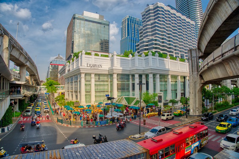
![]()
![]()
![]()
![]() .
.
Elsewhere, the Desert Sun article says the hotel mixed "Asian" and Hawaiian styles. Presumably Asian here mostly means Thai, considering the inspiration for the architect was a Thai building, but, as the article points out, this building would be considered cultural appropriation today, and as with all cultural appropriation, it's almost certain to have inappropriately combined unrelated architecture styles. It must have been confounding to visit, apparently even having a fire breathing dragon somewhere on the property. From the article:
“I remember fondly, watching in awe, the fire-breathing dragon. Some visitors often referred to the hotel [as] Polynesian style, when in fact it was Asian-themed with beautiful murals, silk wallpaper, artwork and garden topiary,” Griffith said.
I also found a blog post by someone who seems to have the same postcard as us (archived link). A few folks in the comments there mention having worked there or visited, one in the catering, but there's no mention of the type of cuisine served.
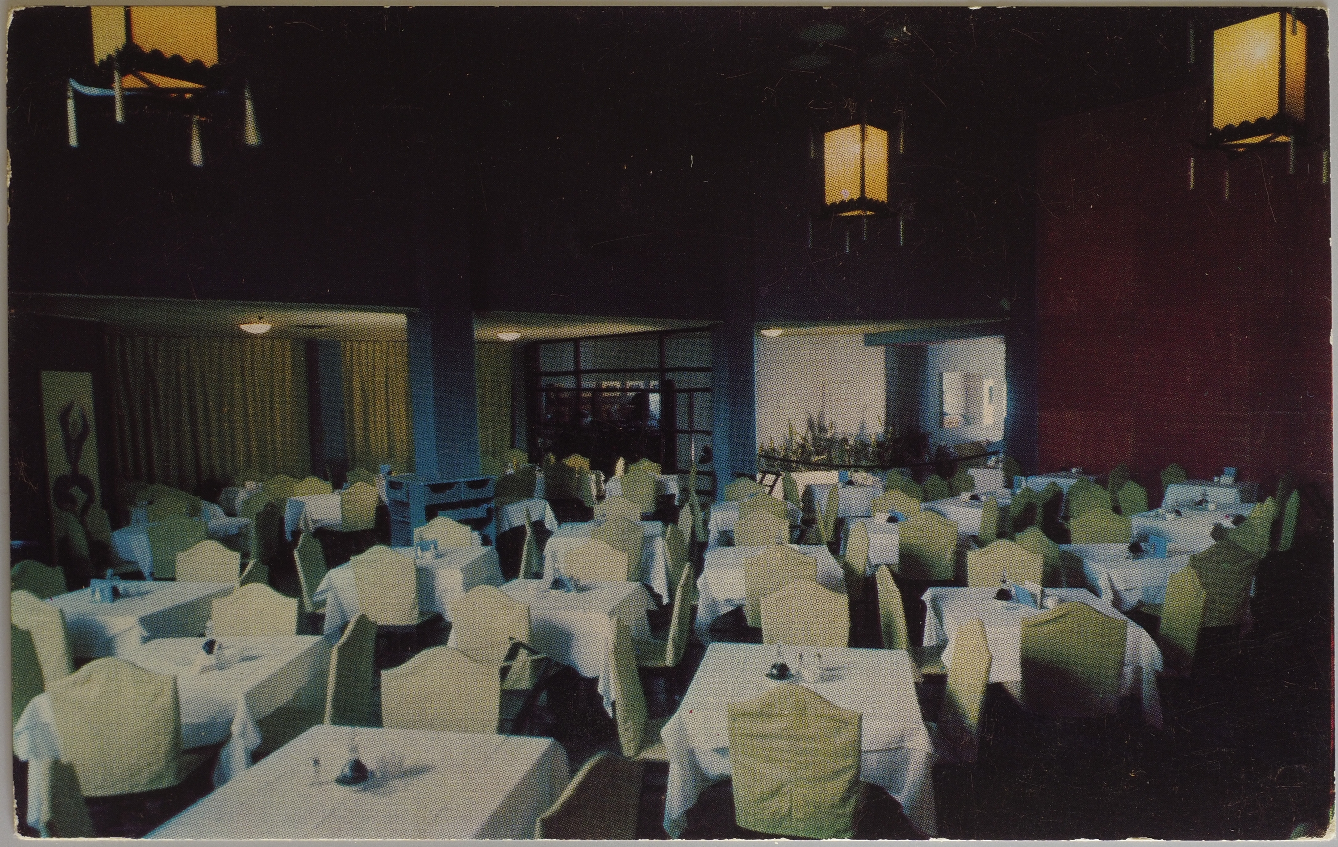
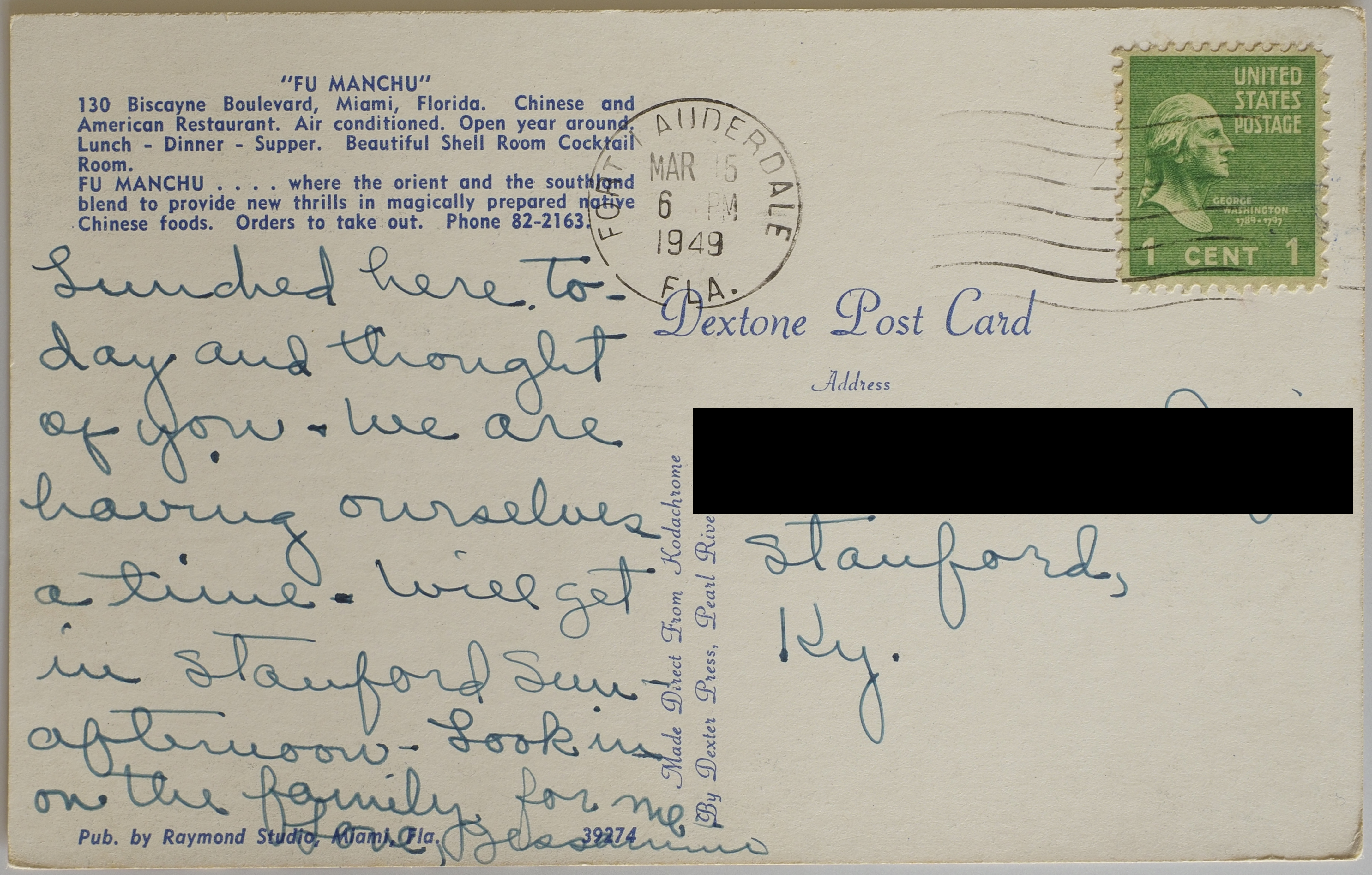
Fu Manchu
This American restaurant has an especially offensive name. The description of itself doesn't help.
"FU MANCHU"
130 Biscayne Boulevard, Miami, Florida. Chinese and American Restaurant. Air conditioned. Open year around. Lunch - Dinner - Supper. Beautiful Shell Room Cocktail Room.
FU MANCHU . . . . where the orient and the southland blend to provide new thrills in magically prepared native Chinese foods. Order to take out. Phone 82-2163.
Pub. By Raymond Studio, Miami Fla. 39274
On the "spine":
Made Direct From Kodachrome
By Dester Press, Pearl River N. Y.
The stamp date says this was mailed in 1949 from Fort Lauderdale.
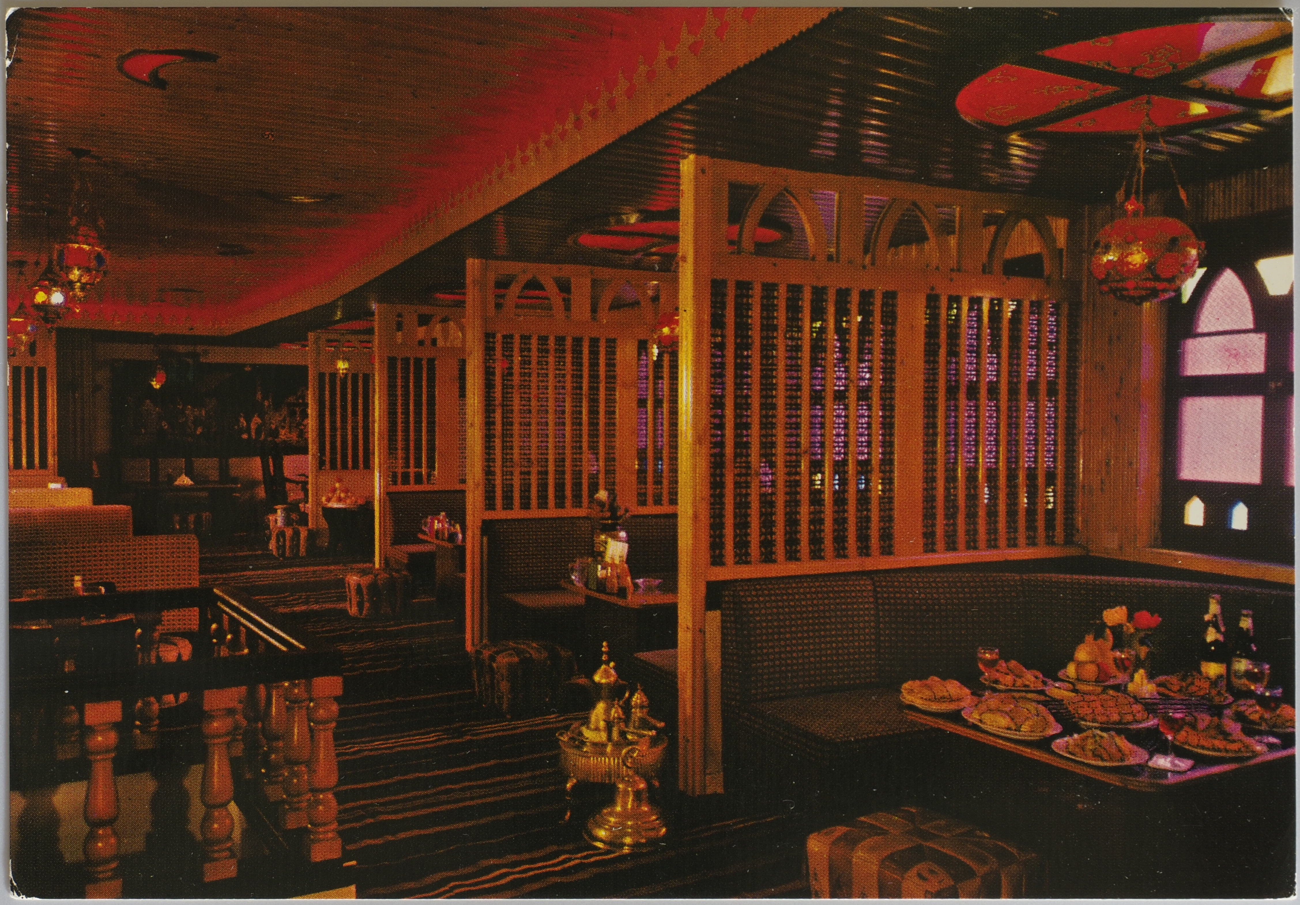
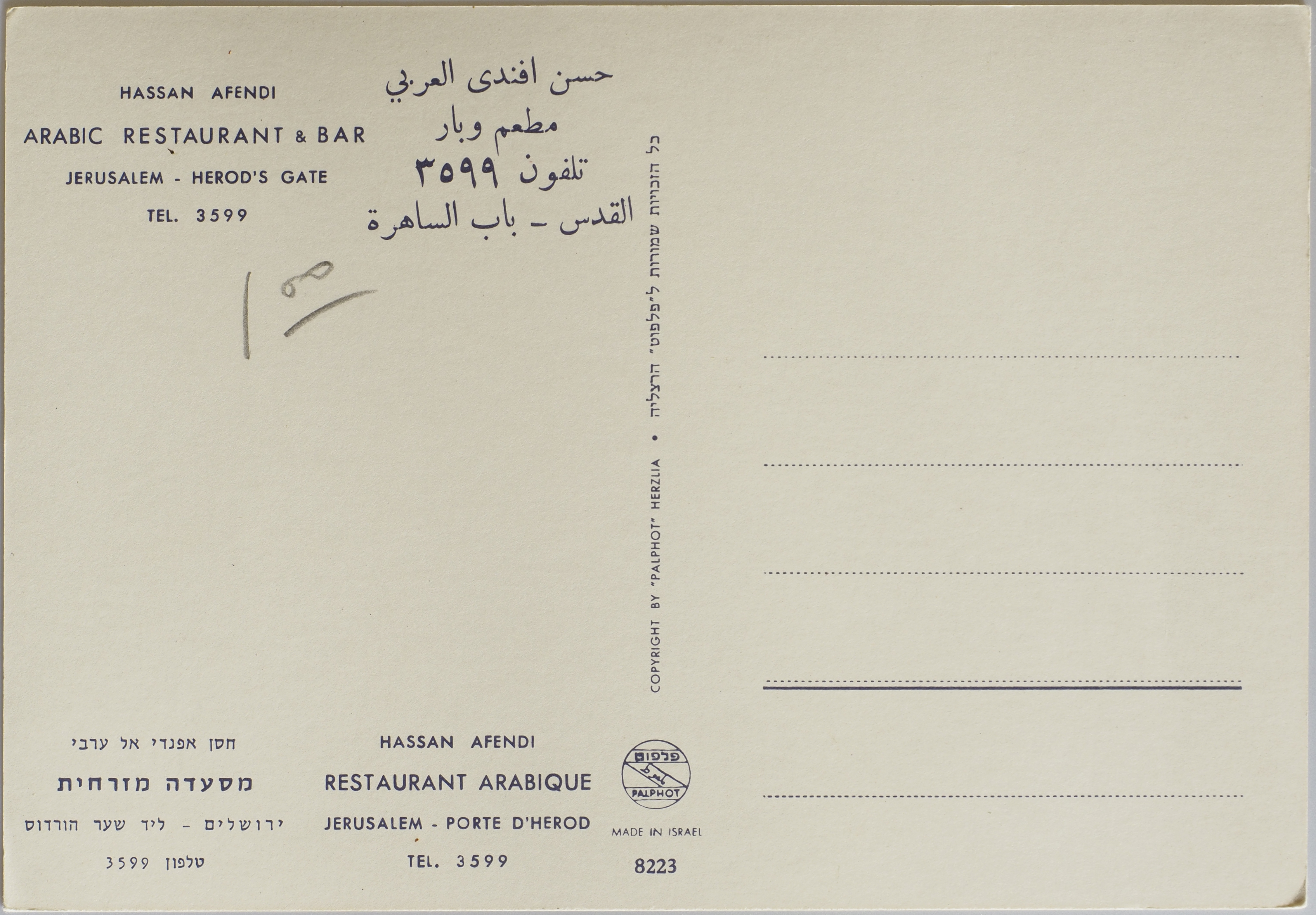
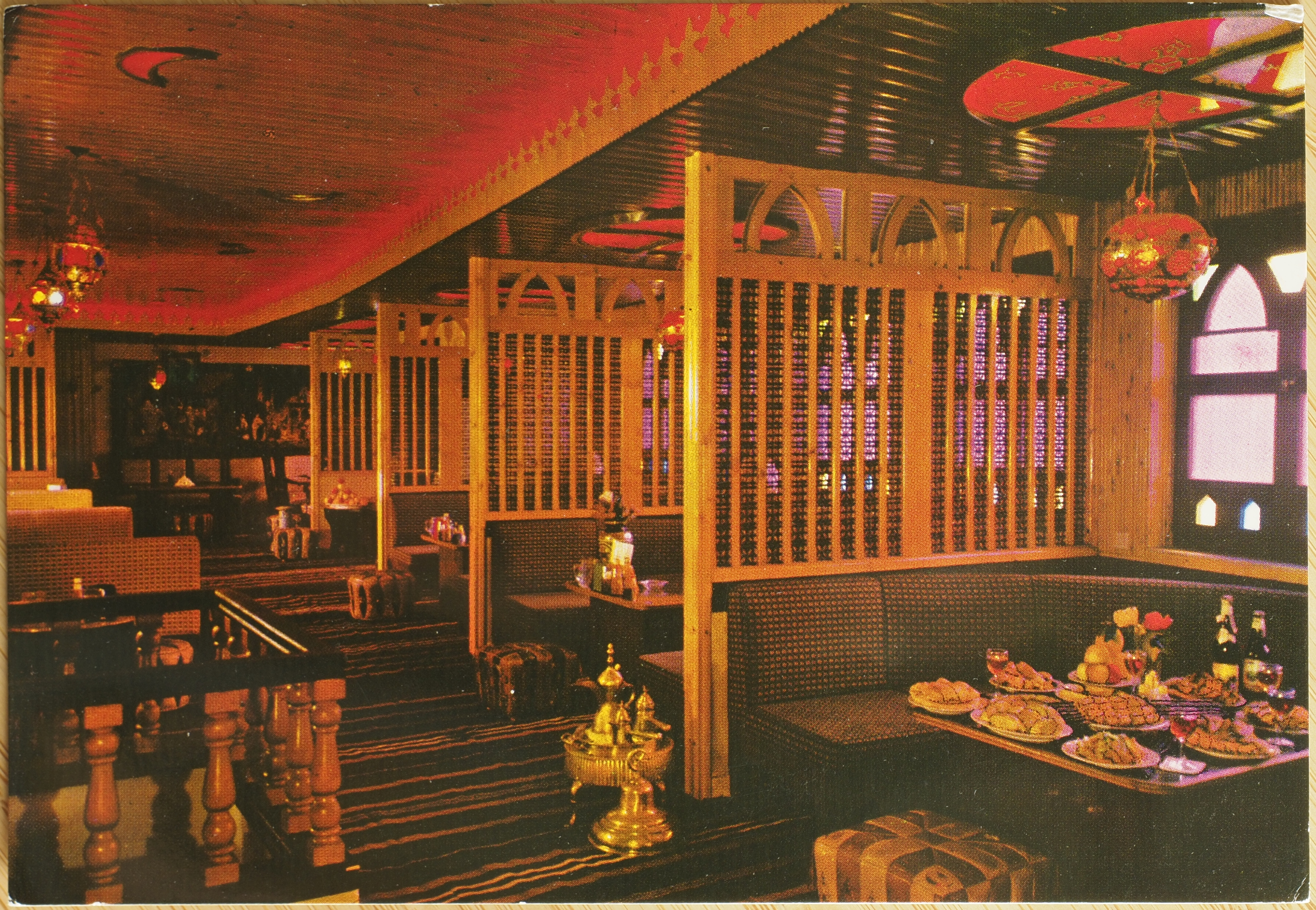
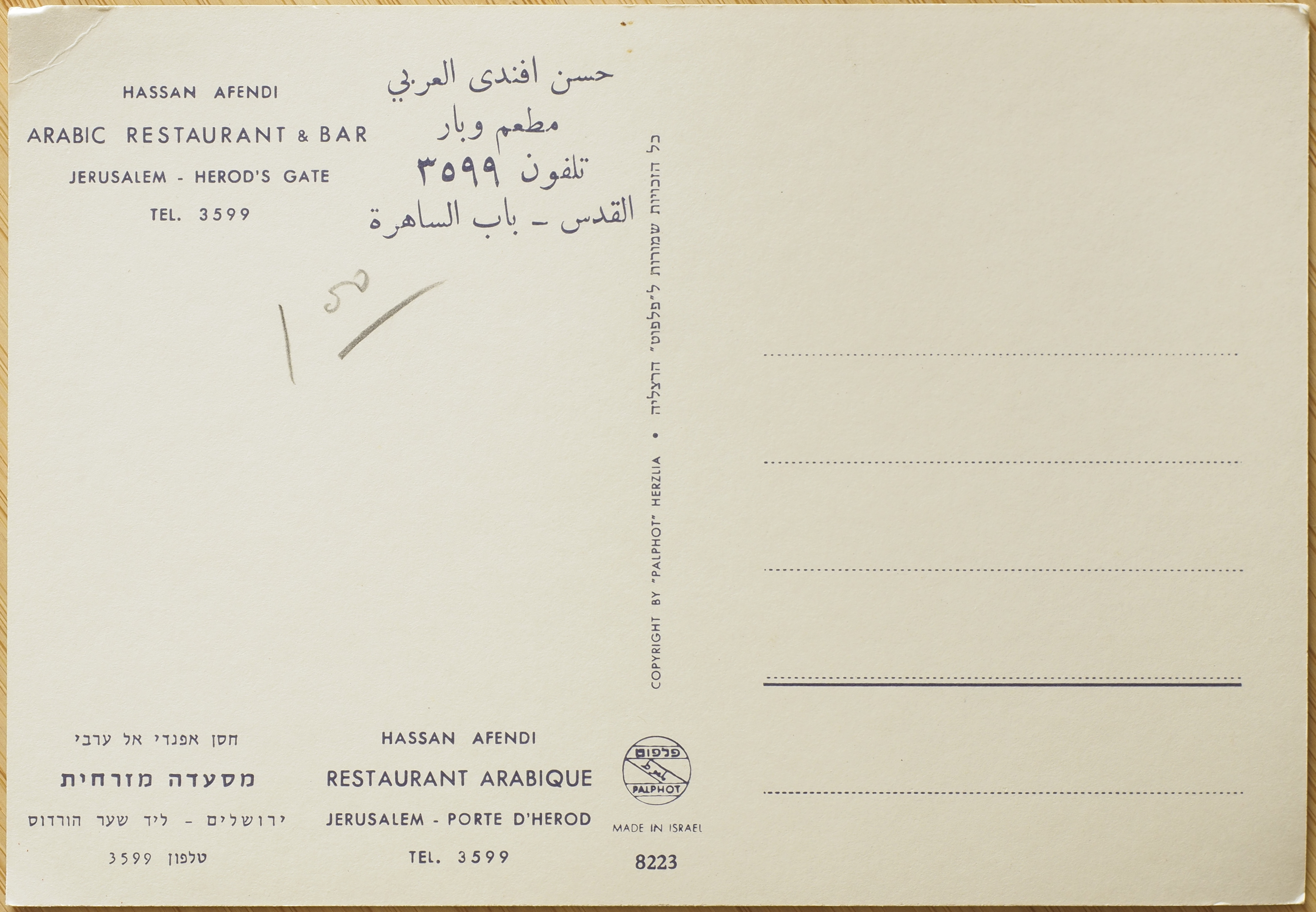
Hassan Afendi
8223
We have two copies of the same postcard, which I either didn't notice the day we bought them, or if I did, I've fogotten that I did. I only realised (either for the first time, or again) while photographing them.
Hassan Afendi
Arabic Restaurant & Bar
Jerusalem - Herod's Gate
TEL. 3599
The text appears on the postcard in English (as above), Arabic, Hebrew, and French.
On the "spine", first in English and then what I presume is the same translated into Hebrew:
Copyright by "Palphot" Herzlia
A seal with "Palphot" written in English and presumably also in Arabic and Hebrew is present. The postcard was made in Israel.

Hoe King Lo
D-14907
Hoe King Lo is the less-well-known restaurant run by an apparently famous Chinese-American restauranteur in the Chicago area, Wayne C. Sit, whose obituary can be found in the Chicago Tribune (archive link). The obituary mentions he ran the much more famous South Pacific Restaurant, which is highlighted in this thread on the "Tiki Central" forum (archive link). Sit and his other restaurant, Hoe King Lo, are also mentioned in that thread. South Pacific Restaurant looks to have been centrally located in Chicago, but Hoe King Lo was way out in the suburbs, which you can clearly see in the photograph shared on this Reddit post of the same restaurant.
According to his obituary, Mr. Sit broke the housing "colour line" in Chicago, which is an incredible feat. If you're unfamiliar with redlining or "colour lines", you can read about them on this page, which describes the practice in Seattle, where I used to live. The practice existed in essentially every single American city. Seattle had notoriously racist housing policies which continue to affect the city's diverse populations to this day and is one of the foundations upon which modern day genetrification is built.
Hoe King Lo may be an example of what folks nowadays call "self-stereotyping", and seems to have had its own amount of cultural appropriation of non-Chinese cultures (specifically, Hawaiian) to appeal to a broader "tiki" aesthetic, which was popular at the time. Self-stereotyping is a complex issue, and this article by Ayesha Sharma is an excellent read about some of the motivations Asian immigrants in particular may have had when doing this, and how that ties into model minority stereotypes.
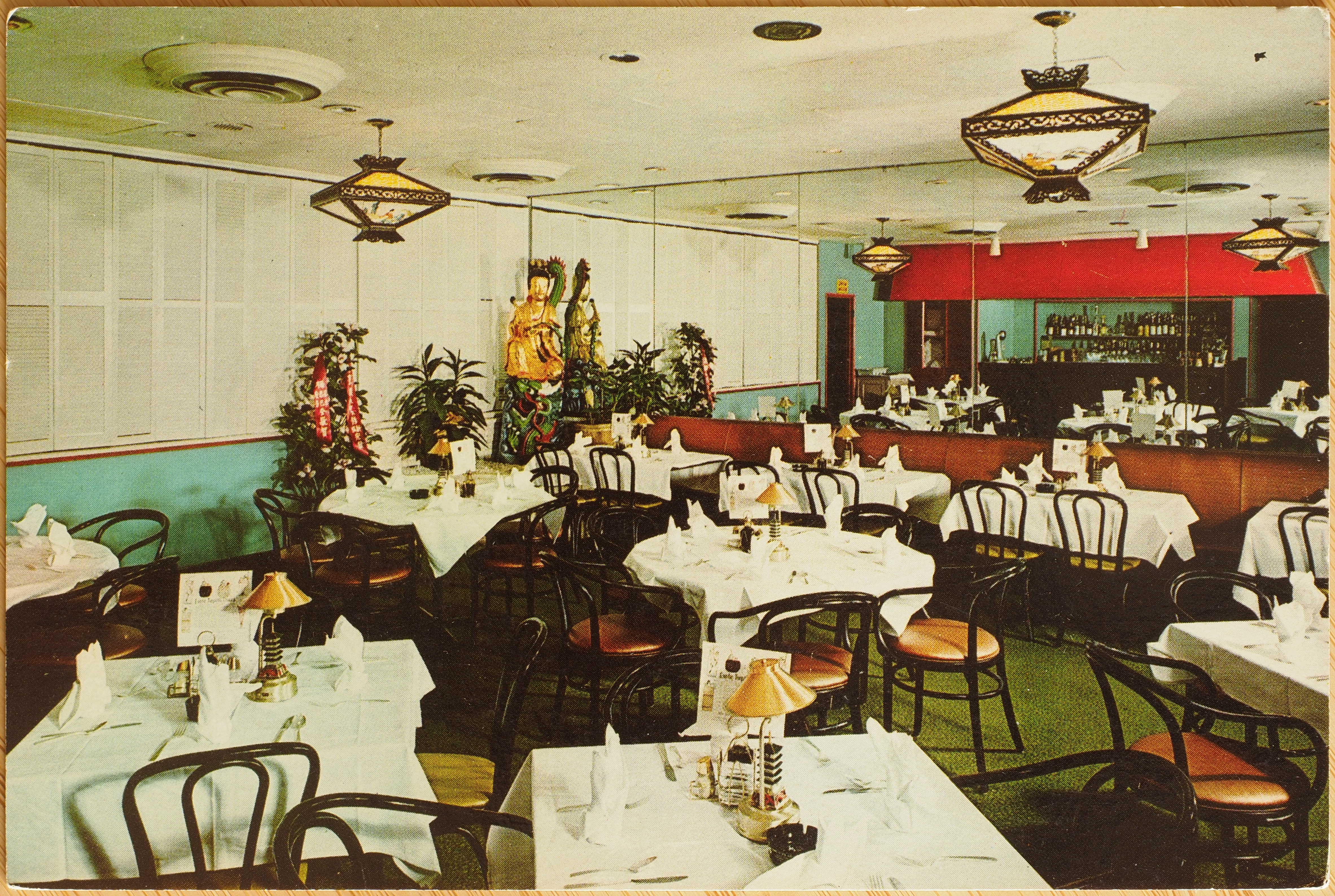
Kuan Yin Room
Hoe King Lo\7201 No. Lincoln Avenue
Lincolnwood, Illinois 60646The most elegant Cantonese Restaurant on Chicago's North Shore. Oriental decor, priceless hand carved teakwood dragon panels, representative of ancient Chinese culture. Superb Chinese and American Cuisine. Refreshing tropical drinks from our Tang Cocktail Lounge.
Private parties - call 679-2980
(Div. of South Pacific Restaurant Co., Inc.)
On the left margin of the back:
Photography by Peter Pearson, Orland Park, Ill.
On the "spine":
Curteichcolor ® 3-D Natural Color Reproductions (REG. U.S.A PAT. OFF.)
This postcard has the same green text as one of the Chiam Restaurant postcards.
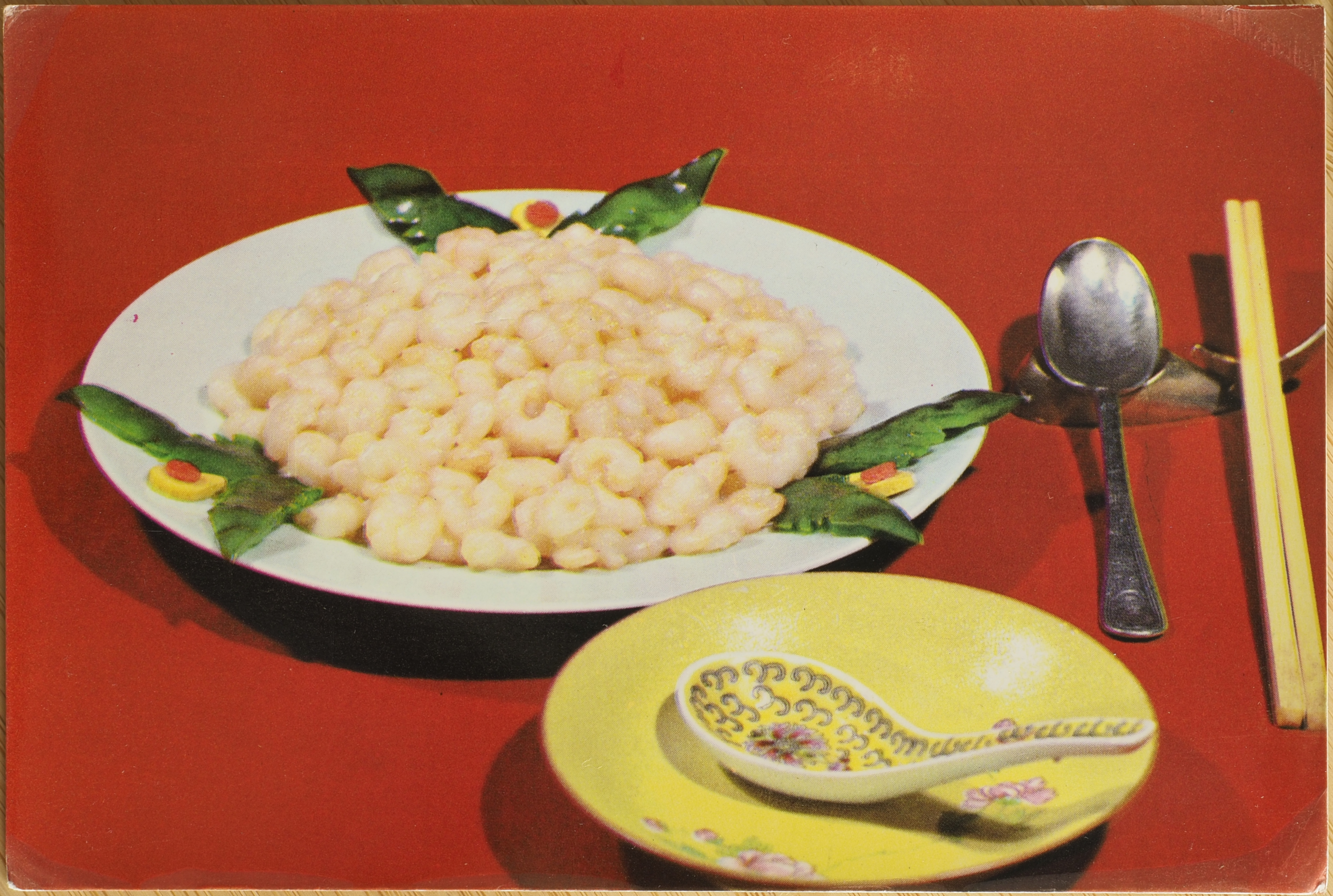
Jing Jiang
Jing Jiang Hotel Dishes & Pastries
Plain Saute Shelled Shrimps
I OCR'd the Chinese on the back of the postcard, which came out to:
锦江饭店菜点 清炒虾仁
Google translates this to "Jinjiang Hotel Dishes Stir-fried Shrimp".
I think the spelling "Jing Jiang" rather than "Jinjiang" is an artefact of older approaches to romanization. Today, all references to Jinjiang, a river, are romanized that way. This might be the hotel the postcard advertised. Jinjiang Hotel opened in 1958, which sounds about right for the postcards we found.
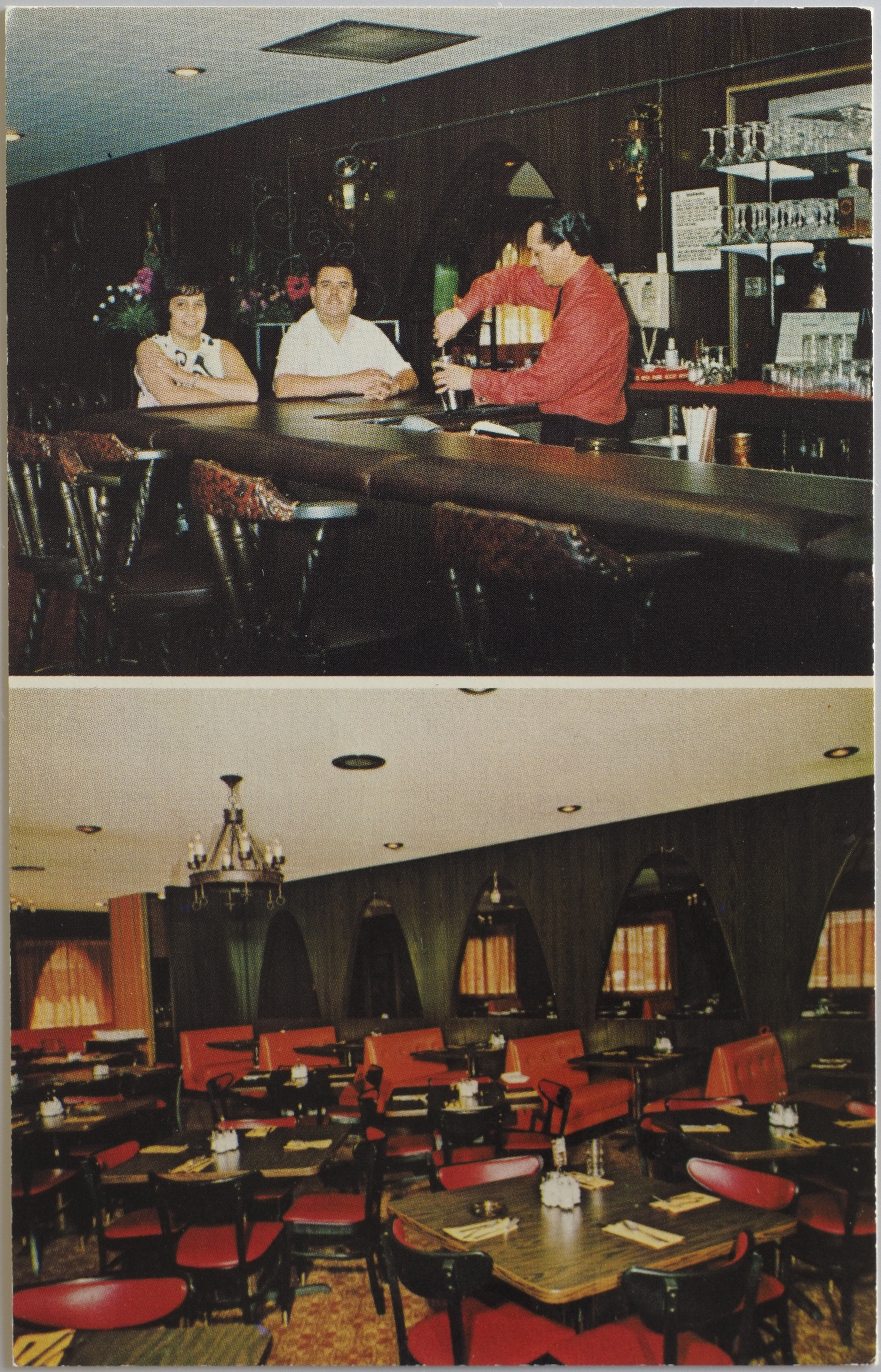
La Nueva Poblana
R26688
This post card really betrays mid-century American priorities. The restaurant is a Mexican restaurant, but the advertisment reassures the reader they have "also steaks and American food", just in case. I suppose that probably reassured some customers who would otherwise have passed on the restaurant altogether.
The front of the postcard has two photogaphs, and the lower one, which shows the dining room, has a disturbingly tilted appearance.
La Nueva Poblana
Mexican Food — Cocktail Lounge
Also Steaks and American Food
Eat Here or Food to GoOpen: Mon.-Thurs. 11 a.m. to 9 p.m.
Fri.-Sat. 11 a.m. to Midnight4001 Tejan Street, Denver, Colorado
Phones: 4553311—458-9919
From the "spine":
Foto Munoz, Denver, Colorado
A seal for "Insilco", Dukane Press, Hollywood, Fla. is in the bottom left, potentially indicating this was printed in Florida. Insilco is probably a reference to the International Silver Company.
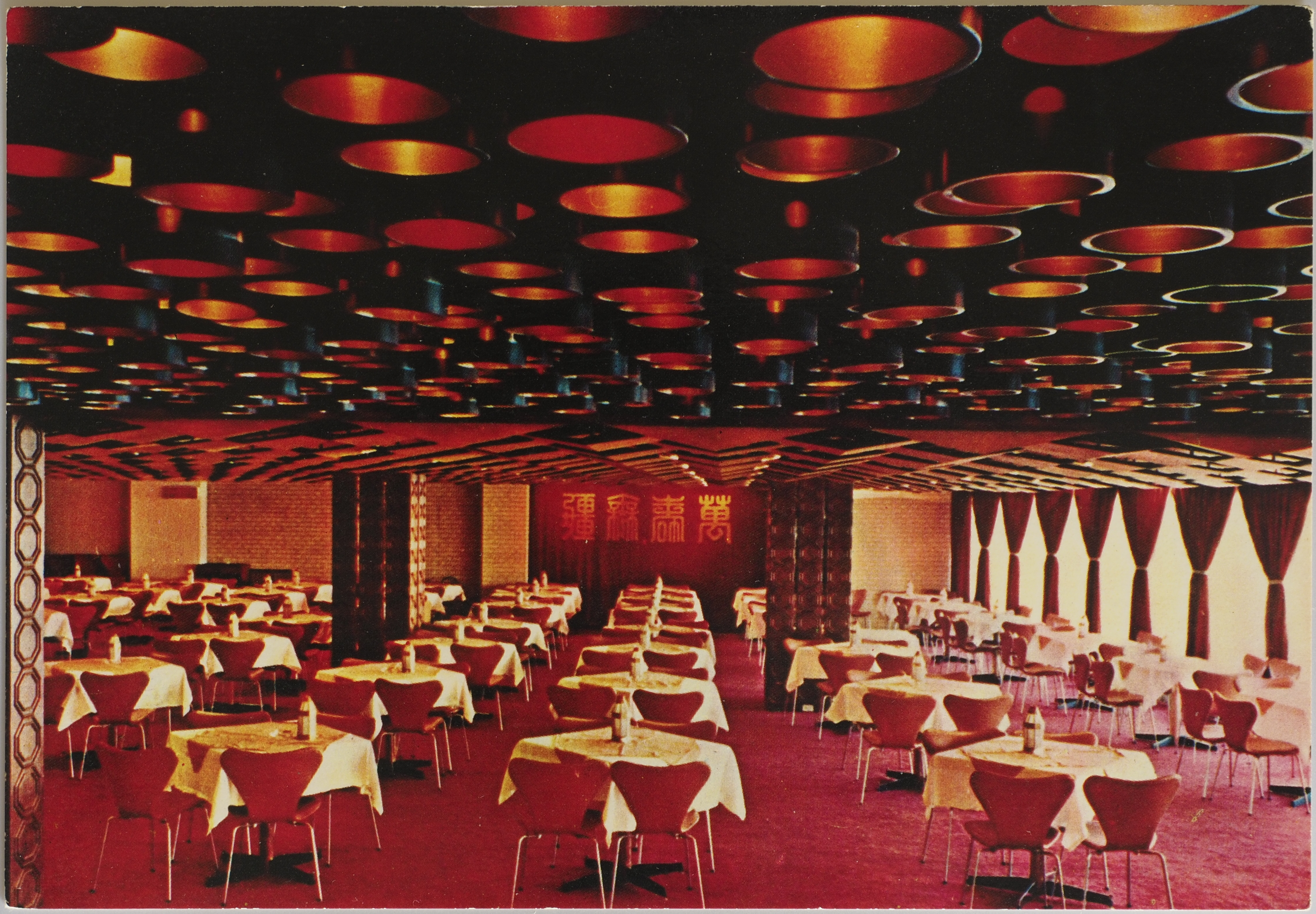
Long Life Restaurant
Again, I used OCR to copy the Chinese text off the back of this postcard.
台北中央大飯店萬壽廳
Long Life Restaurant (2nd Floor)
Central Hotel
Google translates the Chinese text as: "Taipei Central Hotel Wanshou Hall".
On the bottom of the postcard:
Chung Shan N. Rd., Sec. 2, Taipei Taiwan Cable Add ''CENTREL'' Taipei Telex: 21578
I'll be in Taipei next week for WordCamp Asia 2024, so I tried to find this on the map to at least take an exterior photo, but I couldn't find it anywhere. There is a hospital named Chung Shan, but I can't find anything obviously named "Central Hotel" or a Long Life Restaurant on Google maps. That's not to say it definitely doesn't exist anymore, I just can't find it in English.
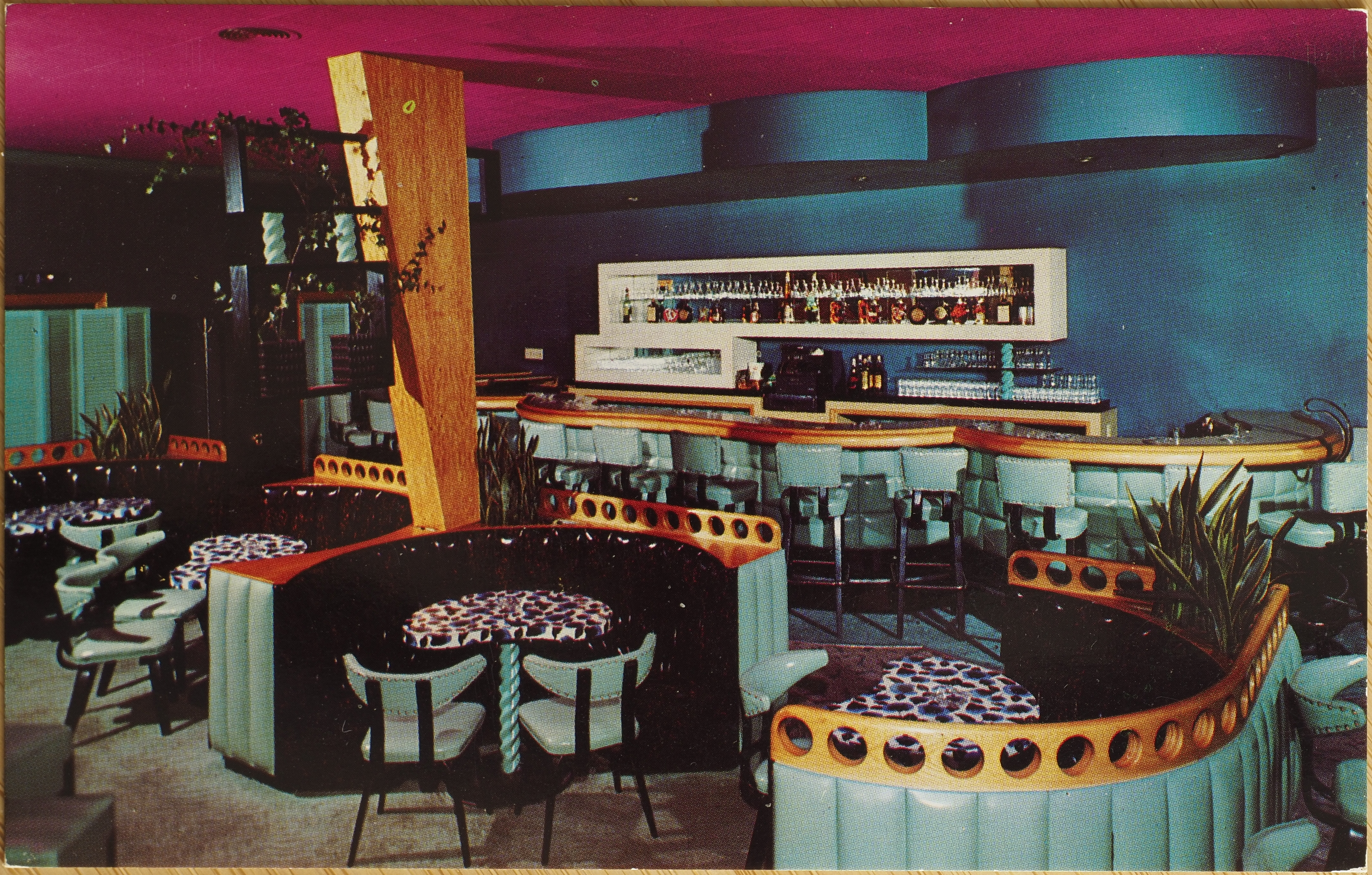
Lotus Room
69269
Lotus Room
Located in the Heart of New Orleans
3340 Canal St.
Rose & Bob OlsenPiano Bar a Favorite with Orleanians . . .
. . . and a Must for TouristsHors d'Oeuvres 4-7 Daily
Along the bottom:
Pub. by Calvin G. Blackwell, New Orleans, La.
Along the "spine":
Genuine Natural Color. Made by Dexter Press, Inc., West Nyack, N.Y.
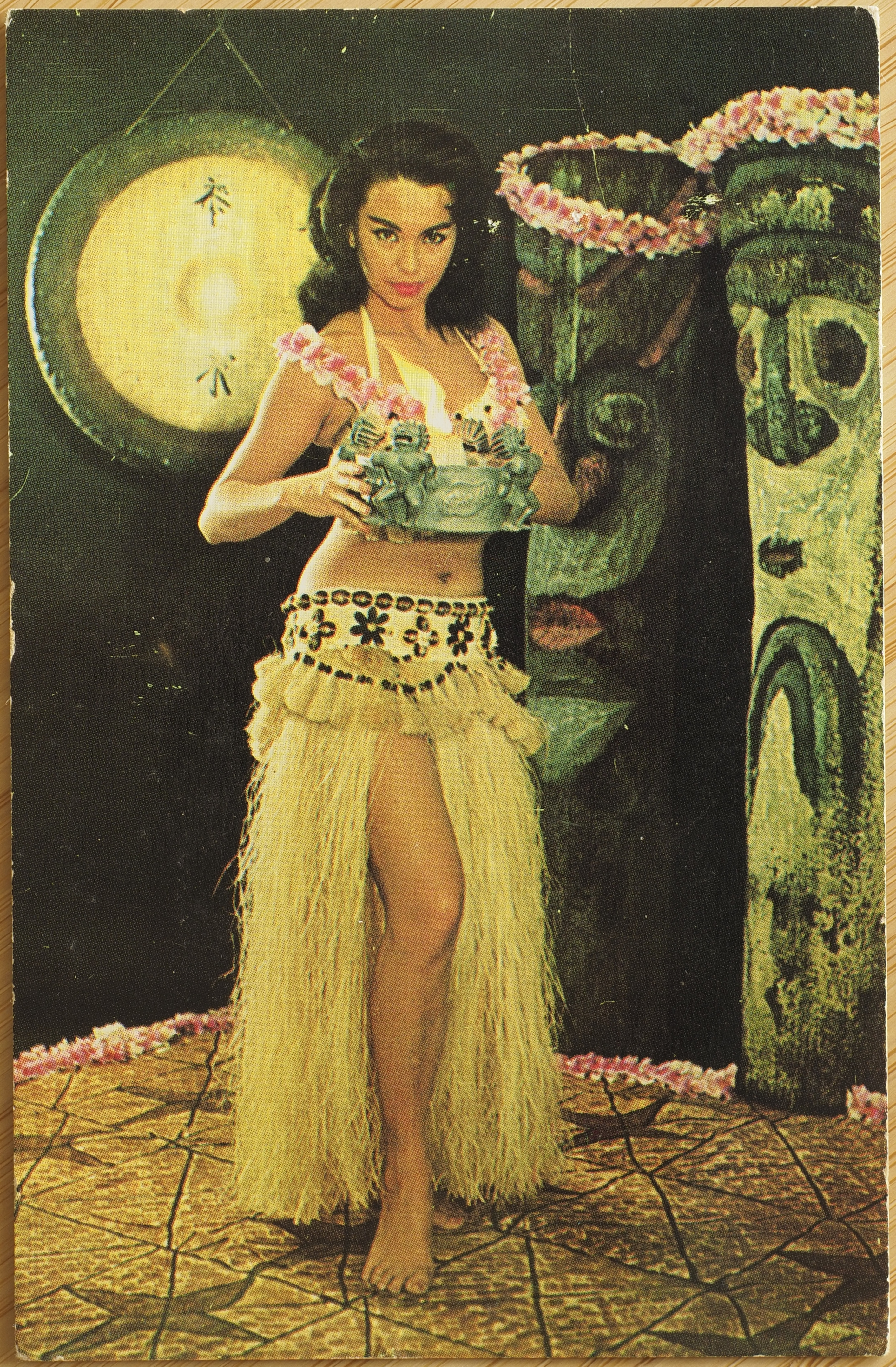
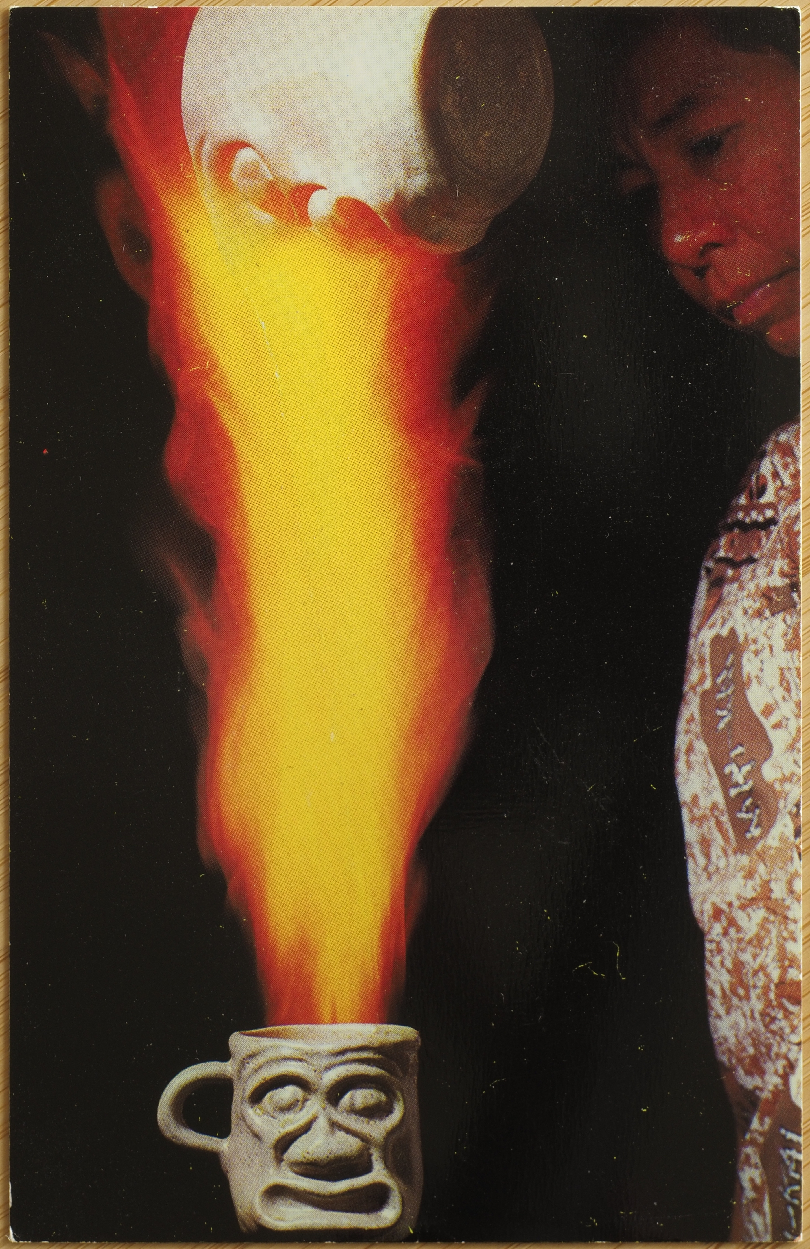
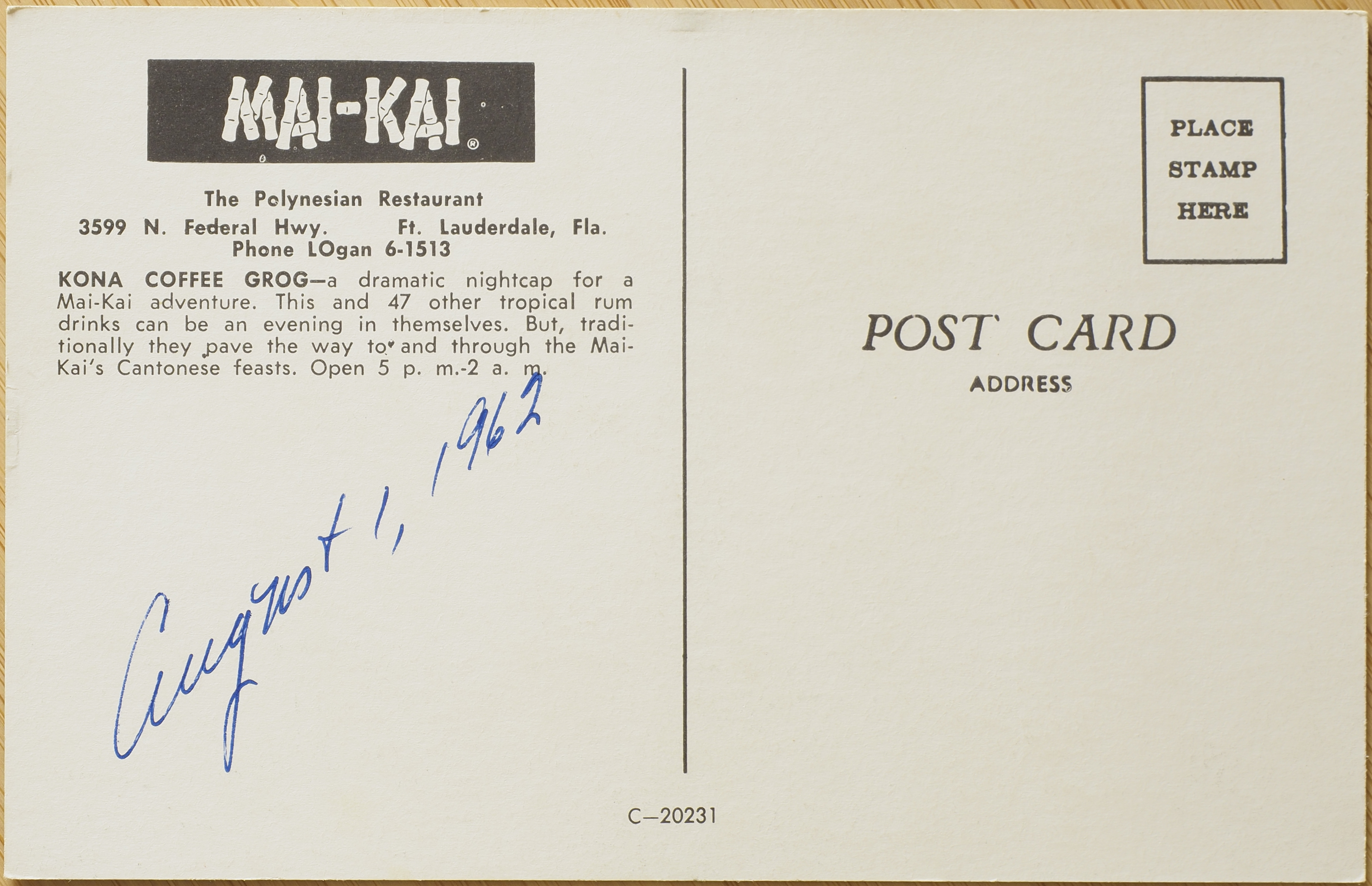
Mai Kai
This place is apparently very famous, as I've seen it mentioned at least two different websites/forums dedicated to "tiki" places that I've visited while writing this blog post.
These two postcards are distinct, with different photos, descriptions, and identifiers. These are also pretty wildly racist, and the place sounds like it is a place to visit. Yes, the tensing of that sentence is correct, the place still exists, and is set to re-open soon, after selling to new owners.
It's yet another example of the "tiki" aesthetic I've referenced: an aesthetic which John Birdsall in the LA Times describes as "built on cultural appropriation and colonial nostalgia". So... yeah, pretty shit!
The descriptions on the cards pretty much make the argument against these places. The relationship to colonialism is worn "on the sleeve" as it were, with the reference to diners as "adventurers", and the obvious objectification of Pasifika women.
I do not, at the moment, understand the relationship to Cantonese cuisine in particular, and am wondering if it's a holdover from a time when "Canton" was potentially the single-most well known reference to Chinese culture in the US, or if they actually mean Cantonese cuisine, as we would understand that category today.
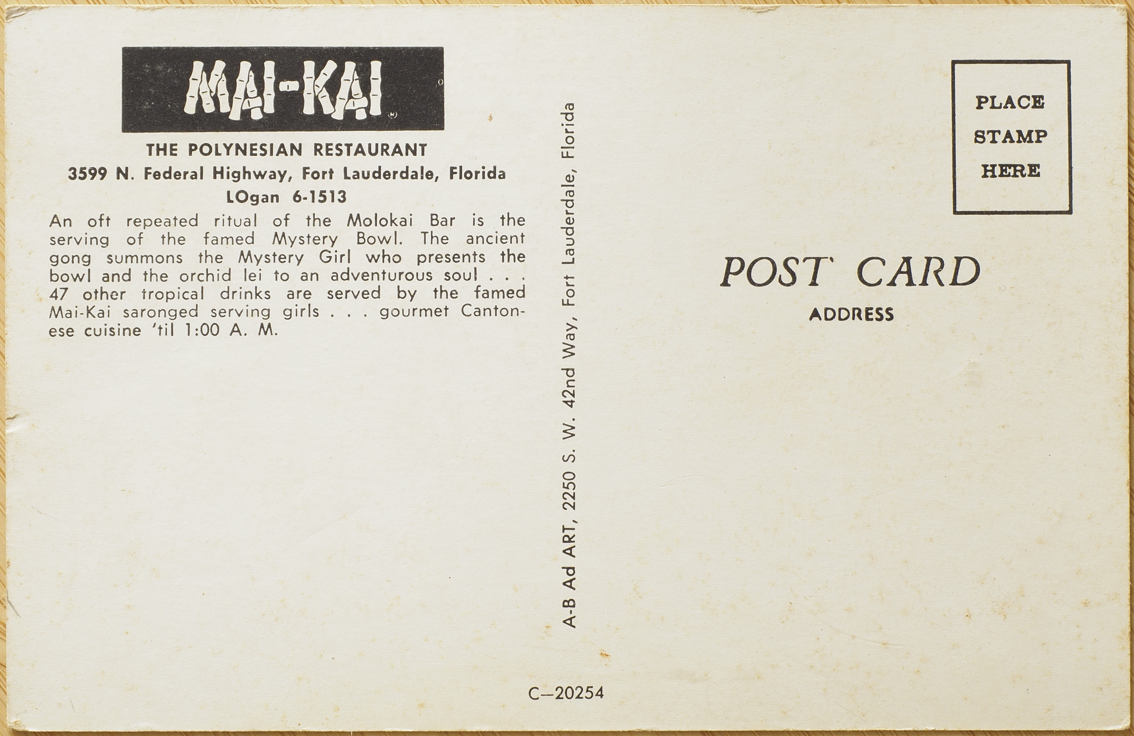
C-20254
This is the one I've dubbed postcard "A".
Mai-Kai
The Polynesian Restaurant
3599 N. Federal Highway, Fort Lauderdale, Florida
LOgan[sic] 6-1513An oft repeated ritual of the Molokai Bar is the serving of the famed Mystery Bowl. The ancient gong summons the Mystery Girl who presents the bowl and the orchid lei to an adverturous soul . . . 47 other tropical drinks are served by the famed Mai-Kai saronged serving girls . . . gourmet Cantonese cuisine ´til 1:00 A. M.
On the "spine":
A-B Ad ART, 2250 S. W. 42nd Way, Fort Lauderdale, Florida
C-20231
This is the one I've dubbed postcard "B".
Mai-Kai
The Polynesian Restaurant
3599 N. Fededral Hwy. Ft. Lauderdale, Fla.
Phone LOgan[sic] 6-1513Kona Coffee Grog—a dramatic nightcap for a Mai-Kai adventure. This and 47 other tropical rum drinks can be an evening in themselves. But, traditionally they pave the way to and through the Mai-Kai's Cantonese feasts. Open 5 p. m.-2[sic] a. m.
This one also has the date August 1, 1962 written in blue pen ink on the back. Unlike the other, there is nothing written on the "spine" or elsewhere to indicate who manufactured or designed the postcard.
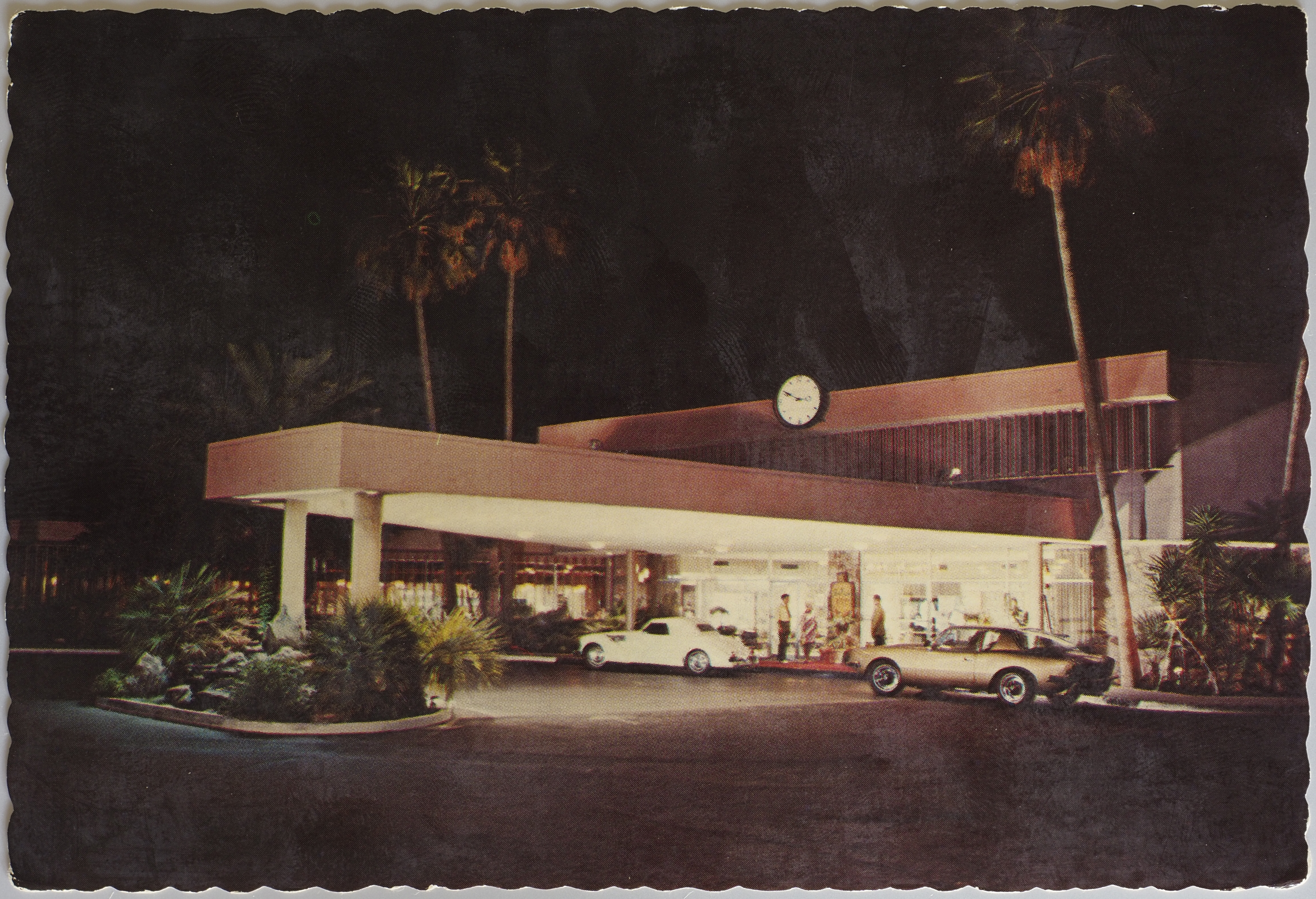
Safari Hotel
54791-C
Safari
Hotel
Scottsdale, Arizona
Scottsdale's most famous address, where you get away to everything. 194 Rooms with complete hotel services. Beauty and Barber Shops. Boutique. Gift and Dress Shops. French Quarter and Cabaret. Safari Lounge. 24-hour Coffee House. An exquisite Dining Room . . . all of these "people pleasures," and Western Hospitality, too!
The opening of this hotel was apparently a "big deal", and is referenced all over the place, including on this list of key historic events for Scottsdale, Arizona. It seems that its name is, for all intents and purposes, entirely cynical, without even actually referencing anything that I could conceive of as "safari".
To clarify the note at the end about "western hospitality". This, at first, struck me as rather "on the nose", but I realised that it is actually a reference to the mythologisation of the American "West", rather than the colonial division of European culture from the rest of the world. I think they're trying to imply they aren't like those yankees who don't treat you right. I could be wrong though, maybe they really are just clarifying that they aren't Africans. It wouldn't be a stretch, considering how plainly racist these places are!
On the "spine":
Pub. by Petley Studios, Inc., 4051 E. Van Buren, Phoenix, Arizona
The image on the front of this postcard has a bad white haze over it. It looks like the kind of haze that comes over a printed photograph when it's been touching the front of another photograph for too long (and usually in some warmth). It's a drab looking place either way.
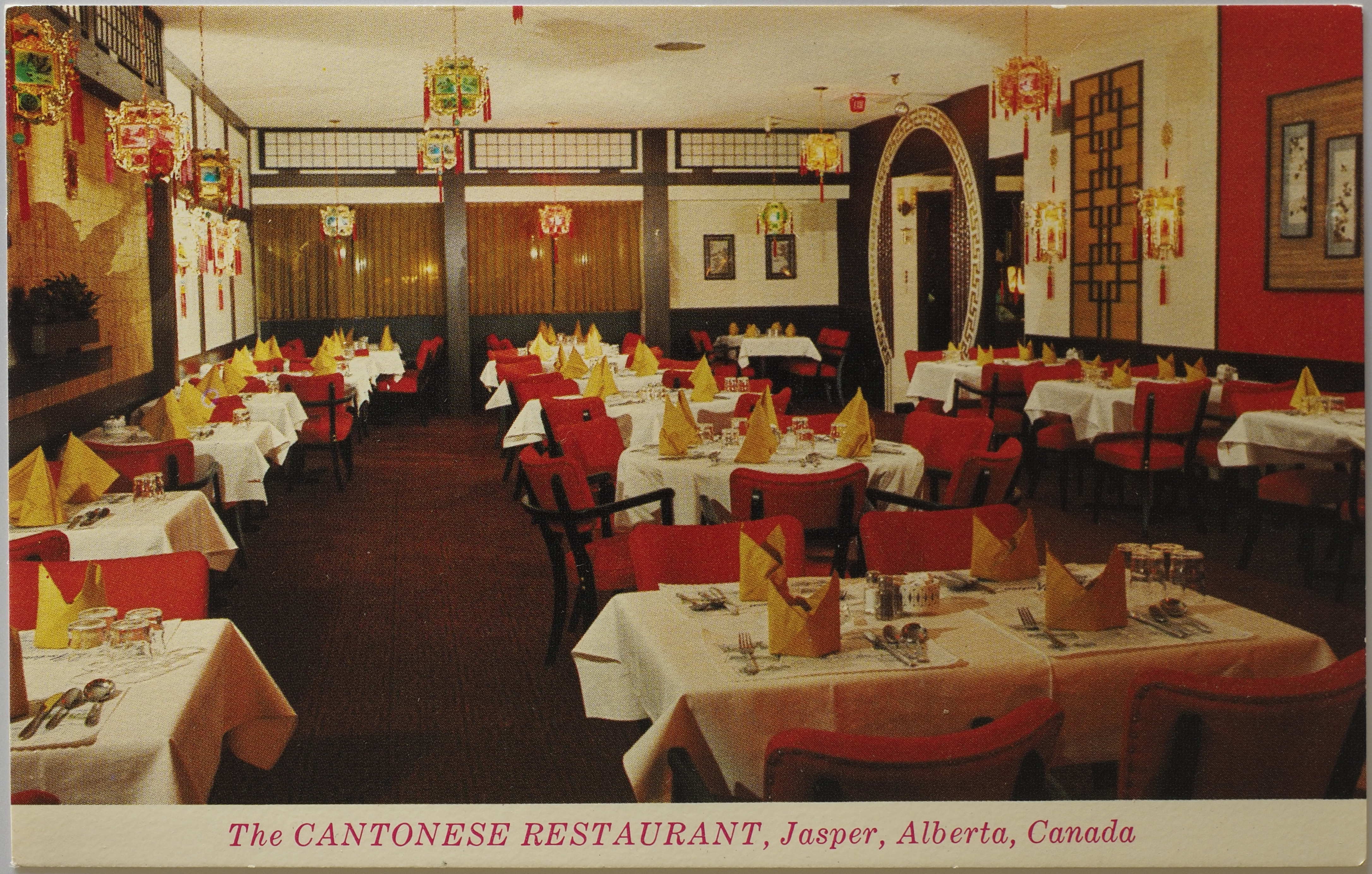
The Cantonese Restaurant
C-2504
With a seating capacity of 135, the Cantonese Restaurant and licensed Dining Lounge offers the finest in Chinese Cuisine served in a unique Oriental atmosphere. A fine selection of steak and seafood is offered for the Western appetite. Open until 1:00 a.m., the Cantonese offers the utmost in service and fine food.
Along the bottom:
Photo by Ray O'Neill
as well as "Traveltime Product". Along the "spine":
Dist. by Rowed & O'Neill Limited, Jasper, Alberta, Canada
Here again, another example of a restaurant needing to clarify that diners shouldn't worry, they definitely have food that will appeal to "western appetites" (steak).
As an aside, I'm really not sure if the name of the place is "Cantonese Restaurant", "The Cantonese Restaurant" (with the definite article), or just "The Cantonese". They play fast and loose with the name (lexically and typographically) on the card, so it's hard to decide what the "name" is.
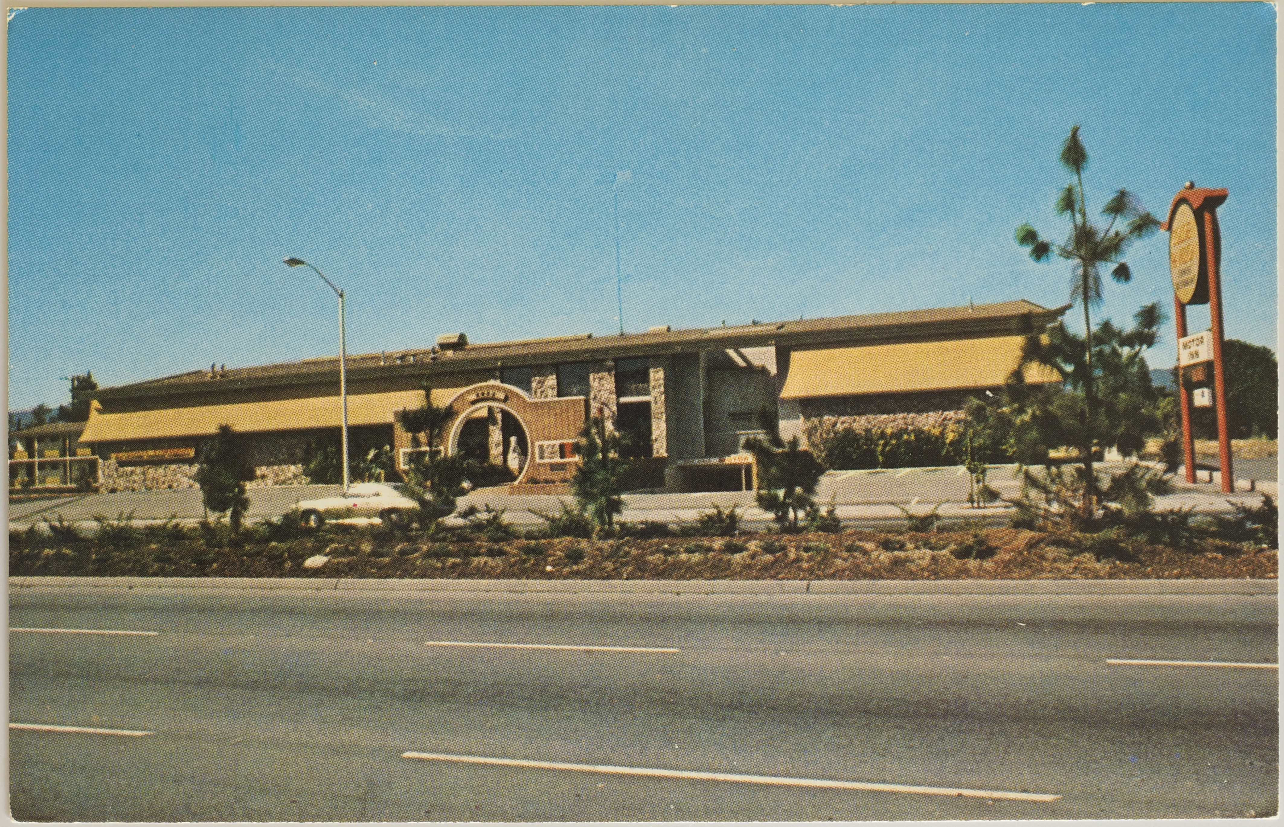
The Golden Pavilion Restaurant and Motor Inn
65127-C
The Golden Pavilion Restaurants are unique among Chinese restaurants in America or China, in that they serve food from all Six Classic Chinese Cuisines. Delightfully comfortable and decorated with rare works of Chinese art, the Golden Pavilion Restaurants are found in San Francisco and Los Altos, California. Operated in conjunction with Golden Pavilion Motor Inn, feature restful quiet, pool, color TV, and extra large beds and rooms at moderate prices. Commercial rates.
The Golden Pavilion Restaurant and Motor Inn
4320 El Camino Real, Los Altos, Calif. 94022
Phone (415) 941-5656
Along the "spine":
Pub. by Smith News Co., 460 9th St., San Francisco, Calif. 94103
Another one made by Dexter Press, Inc in West Nyack, New York. These Dexter Press folks must have been one of the major players in postcard adverts.
Note the interesting call-out in the description of The Golden Pavilion being unique in "serv[ing] food from all six classic Chinese cuisines". That appears to be a reference to a categorisation of Chinese cuisine that persists to this day. Though, I can only find references to lists of either four or later eight cuisines, but not six.
On Flickr, I found another postcard for this chain:

It doesn't look to be around anymore, so I'm not sure what to make of this place. This website claims one of the locations (presumably the one in SF) held a 300 year old lacquer screen from the Qing Dynasty.
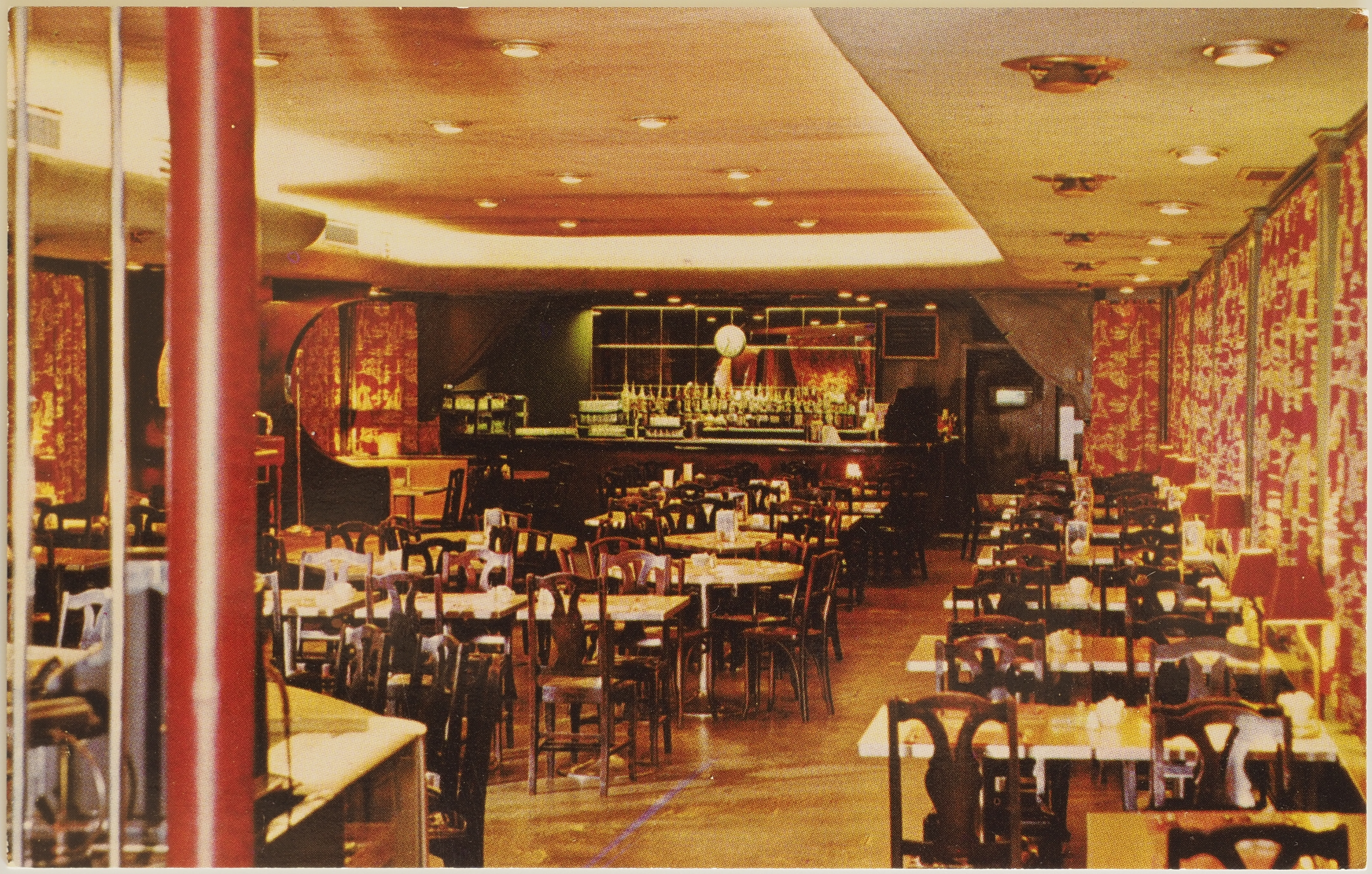
The Grange Dining Lounge
7C-K764
This is part of the same overall establishment as the Temple Court Lounge.
The Grange Dining Lounge
Epicurean Pleasure — Fine Food has long been synonymous with the "Grange Cafe Tavern" 25-27 King Street West, Hamilton, Canada, where its Dining Lounge attracts the most discriminating diners from near and far. Its menus offer tantalizing arrays of Western and Chinese dishes in infinite variety. Here, cuisine has become a creative art.
Photo by Arno-Bonnay
Along the "spine":
Curteichcolor ® Published by Canadian Productions Company Hamilton, Canada
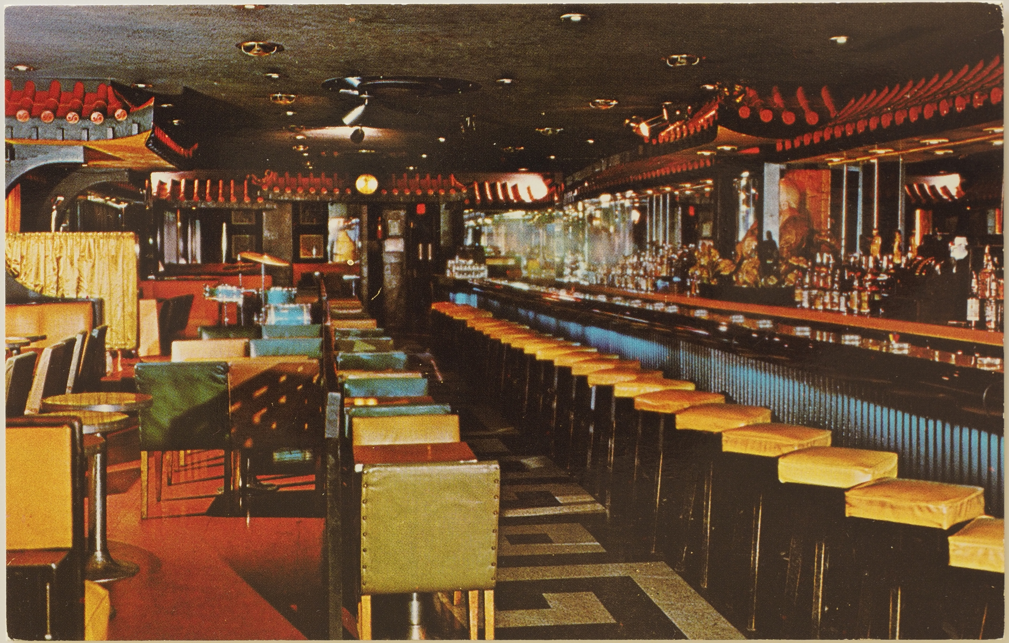
The Temple Court Lounge
7C-K753
This is part of the same overall establishment as the Grange Dining Lounge.
The Temple Court Lounge A touch of the Orient — The Temple Court Lounge brings the exotic atmosphere of the East, for guests of the Grange Cafe Tavern, 25-27 King Street West, Hamilton, Canada. A massive Buddha dominates the fascinating Chinese Temple motif and the Court's striking appointments offer the ultimate in lounge relaxation.
Photo by Arno-Bonnay
It's a little odd to think of the Buddha "dominating", but there you go. I'm not sure to what the "Court's striking appointments" are a reference.
Along the "spine":
Curteichcolor ® Published by Canadian Productions Company Hamilton, Canada
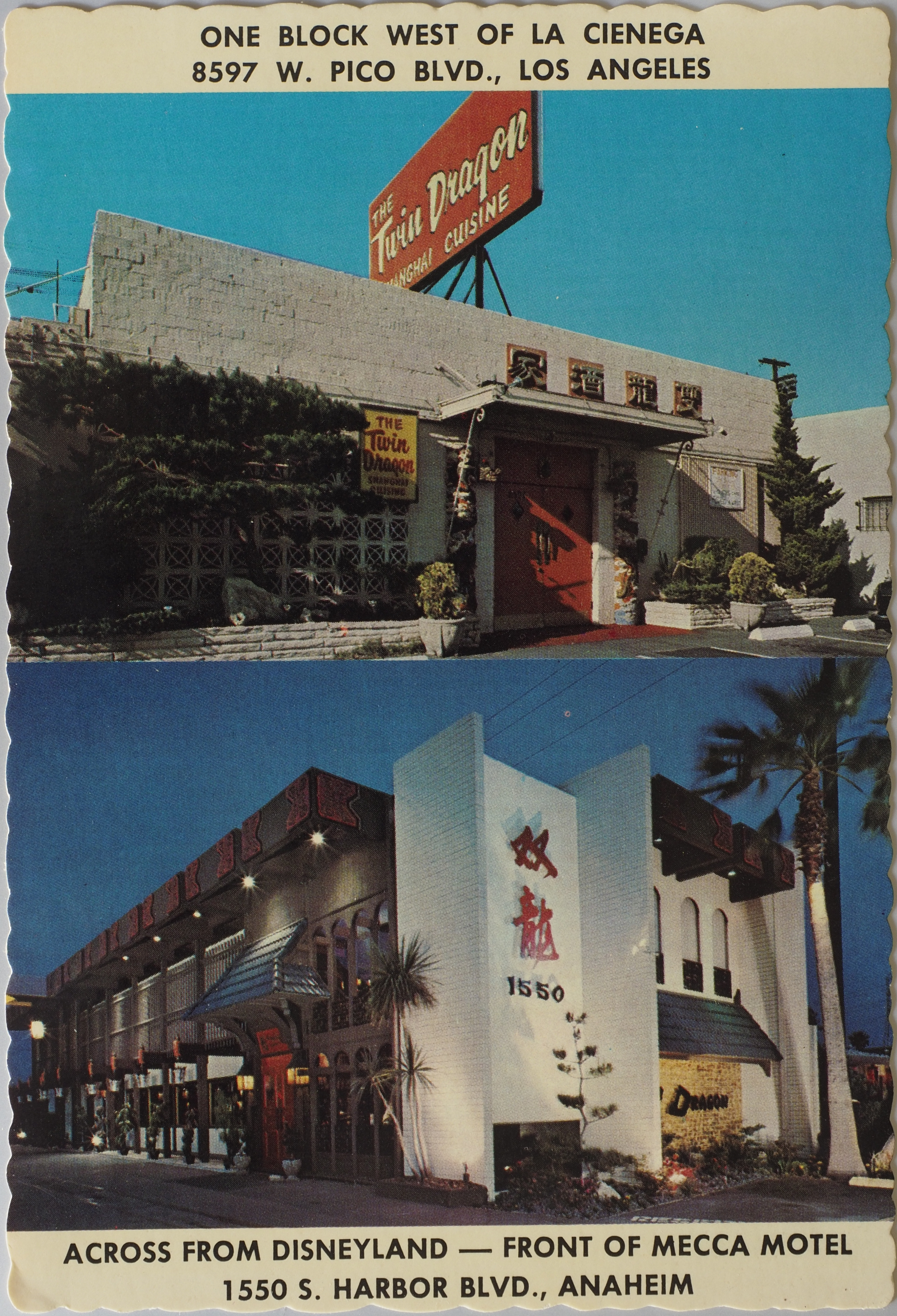
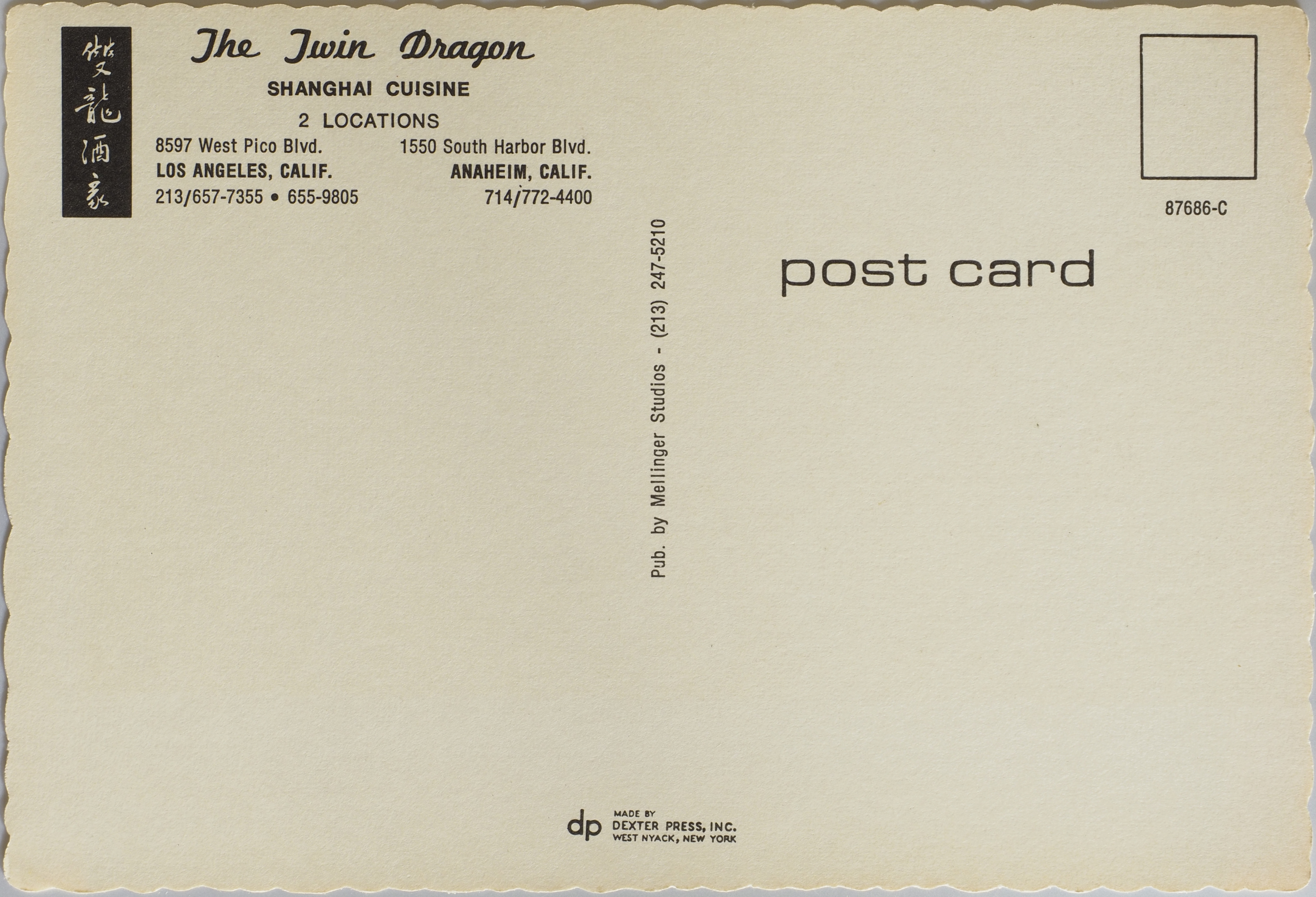
The Twin Dragon
87686-C
From the back of the card:
The Twin Dragon
Shanghai Cuisine
2 Locations
8597 West Pico Blvd. 1550 South Harbor Blvd. Los Angeles, Calif. Anaheim, Calif. 213/657-7355 • 655-9805 714/722-4400
Along the "spine":
Pub. by Mellinger Studios - (213) 247-5210
This one is also made by Dextern Press, Inc. of West Nyack, New York.
The front of this card also has text. Along the top:
One block west of La Cienaga
8597 W. Pico Blvd., Los Angeles
And along the bottom:
Across from Disneyland — front of Mecca Motel
1550 S. Harbor Blvd., Anaheim
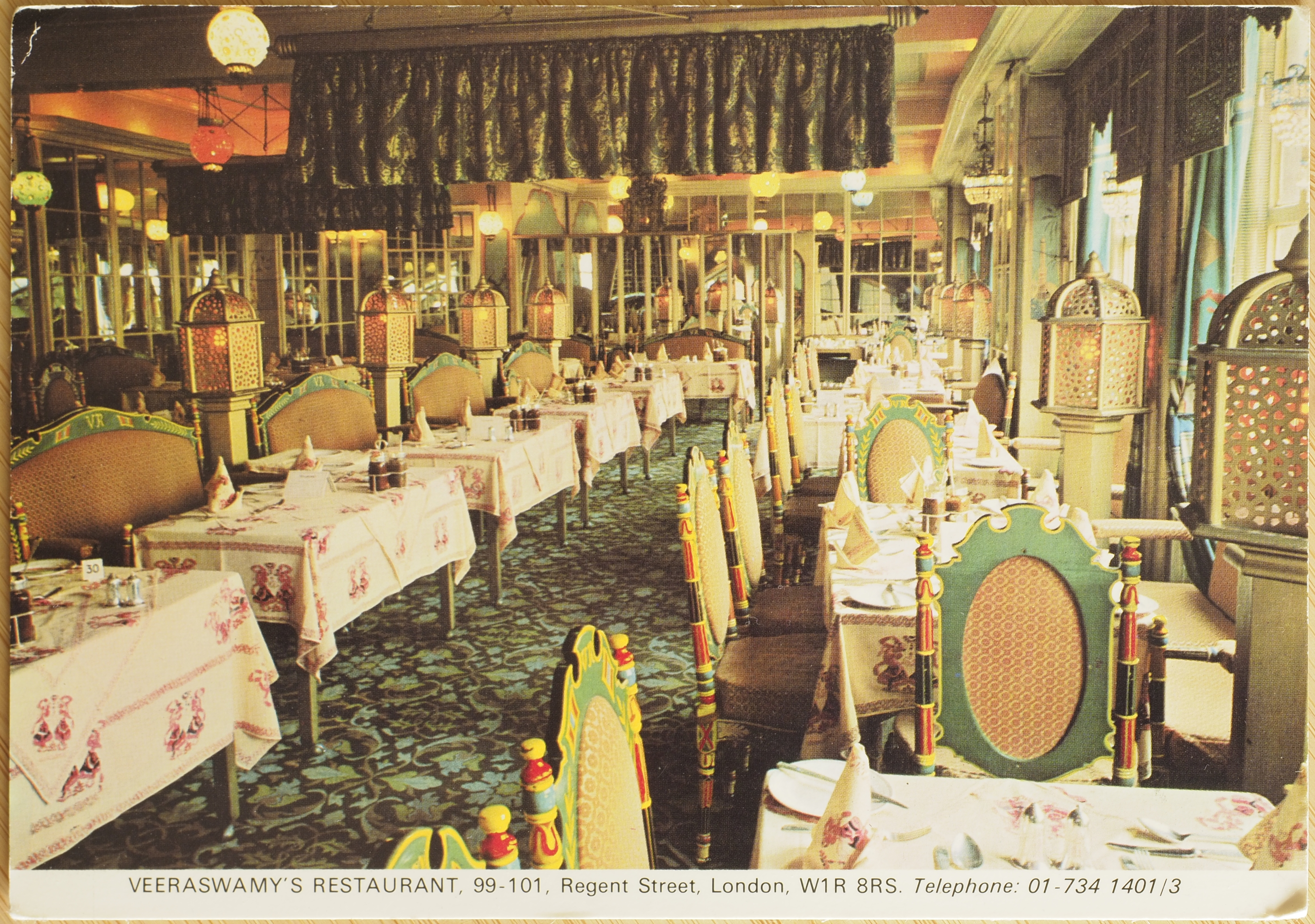
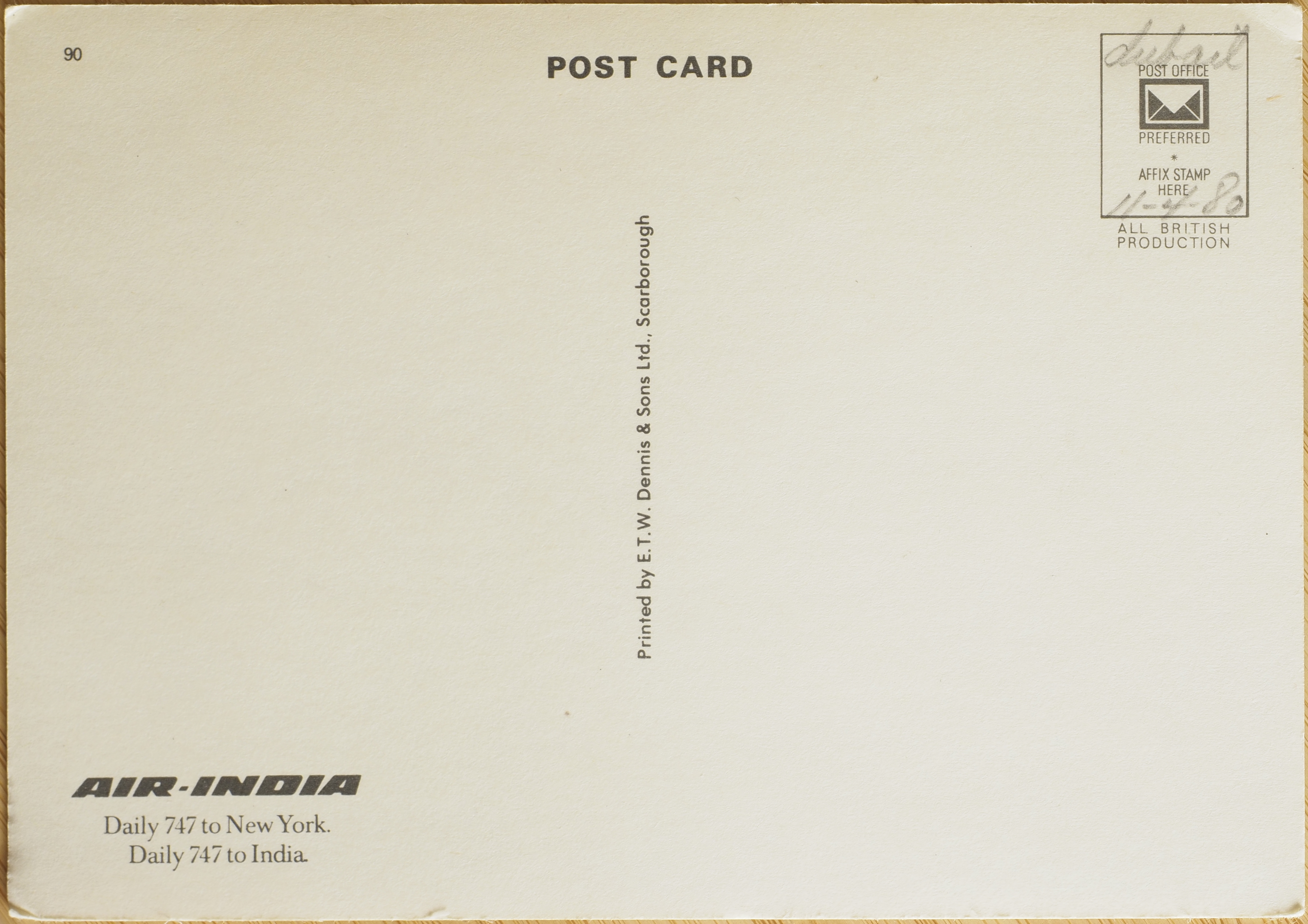
Veeraswamy's Restaurant
90
This postcard lacks any description of the establishment on the back. The front has the following text along the bottom:
Veeraswamy's Restaurant. 99-101. Regent Street, London W1R 8RS. Telephone: 01-734 1401/3
The back includes an advert for Air India.
Air-India [their logo]
Daily 747 to New York.
Daily 747 to India.
I assume this is advertising services from London, given the restaurant's location.
Along the "spine":
Printed by E.T.W. Dennis & Sons Ltd., Scarborough
The stamp area also notes that the card is an "all British production".
Writing in pencil indicates this card is at least from the early 80s, with the date 11-4-80. I'm not sure when the UK stopped using month/day/year notation, but if an American wrote it (good chances that is the case, considering we found these postcards in the US), it would be 4 November 1980. Otherwise, it's 11 April 1980.